A collection of icons for designers and developers, organized by category and ready to drop into any project.
Creating Icon Families with Shared Visual Elements
A strong icon set feels like a single visual language rather than a collection of unrelated symbols. When every graphic follows the same rules for shape, stroke, spacing and perspective, users can scan an interface quickly and designers can expand the set without making each new icon from scratch.
For projects built in Australia, this consistency matters across responsive websites, mobile applications, presentations and client mockups. A Sydney startup, a Melbourne retailer or a local council service may need icons that work equally well on a desktop dashboard, a phone screen and printed campaign material. A well-planned icon family keeps those touchpoints recognisable.
Define The Family’s Visual DNA
Begin by setting a small group of decisions that every icon must obey. Choose a grid, corner radius, stroke weight, line-cap style and preferred level of detail. These rules form the visual DNA of the collection and prevent individual symbols from drifting as the family grows.
Decide how the icons will represent depth and emphasis. A flat set may use solid fills with one accent colour, while an interface pack might combine outlines with small filled details. Avoid mixing a three-quarter perspective with front-facing symbols unless the change is intentional and applied across the entire collection.
Build Around Shared Geometry
A consistent grid makes similar objects feel related. Place each icon inside the same square frame, then establish safe margins so that a cloud, credit card and suitcase occupy comparable visual space. The artwork does not need identical dimensions, but its perceived weight should remain balanced from one symbol to the next.
Reusable shapes speed up production in Photoshop PSD files. Circles, rounded rectangles, arrows and notification dots can become editable building blocks. For a finance collection, the same base rectangle might support a bank card, invoice, wallet and payment terminal, with only the distinguishing details changing.
Control Colour, Contrast And Meaning
Colour should carry meaning without becoming the only way users understand an icon. A red alert symbol, green success mark or blue information badge can be useful, yet each graphic should remain recognisable in monochrome. This is especially important for presentations viewed through projectors or for interfaces using accessibility-focused colour schemes.
Create a compact palette with a primary, secondary and neutral tone. Check the contrast between strokes and backgrounds at the smallest intended size. If the icon set will appear in an Australian government, education or healthcare project, restrained colour choices can also help it sit comfortably beside established brand guidelines.
Design For Real-World File Use
Icon families should be built for the way designers and developers actually work. Keep layers named clearly, align vectors to the grid and preserve editable shapes in PSD format. Export transparent PNG files at practical sizes, such as 16, 24, 32 and 48 pixels, while retaining the master artwork for later revisions.
A useful test is to place the icons in a mock website, an app navigation bar and a presentation slide. Explore relevant visual references such as these space icon examples when developing science or technology themes, then adapt the same principles to your own subject matter rather than copying isolated details.
Adapt The System To Australian Contexts
Local context can influence both subject matter and styling. A travel icon family for the Australian market may need symbols for coastal trips, road journeys, national parks and airport transfers, while a finance set could include imagery suited to tap-and-go payments, budgeting apps and end-of-financial-year campaigns.
Consider how the collection will appear across Australian cities and regions. An icon used by a Brisbane tourism service may sit beside bright photography and informal copy, while a Melbourne arts organisation may prefer a quieter editorial style. Sydney transport or property interfaces often demand compact symbols that remain clear in dense, mobile-first layouts.
Extend And Maintain The Collection
Plan the family in clusters instead of drawing icons in random order. Start with a core group of high-frequency symbols, then expand into related categories such as business, technology, finance, travel, social media and user interfaces. This approach reveals missing shapes and makes the set easier to browse or sell as a complete pack.
When adding a new symbol, compare it with several existing icons at the same display size. Check its optical weight, negative space and visual centre. Premium packs can include alternate states, larger illustrations and specialist symbols, while free collections can offer a carefully selected foundation that demonstrates the system clearly.
Quality Checks Before Release
A short review process catches inconsistencies before the files reach a client or marketplace. Use the same checklist for every update, whether the collection is a small free download or an expanded premium release.
- Compare stroke widths, corner radii and alignment against the master grid.
- Test every icon at small, medium and presentation-scale sizes.
- Preview the set on light, dark and neutral backgrounds.
- Confirm that PSD layers, vector paths and transparent PNG exports are clearly organised.
Keep version names and export folders consistent so developers can identify the correct asset quickly. Email updates can then announce new releases without forcing subscribers to relearn the file structure or visual language each time the collection expands.
A coherent icon family gives designers a reliable foundation for websites, applications, mockups and presentations. Explore the PSD Icons catalogue for a starting set, study how its free and premium collections handle shared forms, and build your next interface around a visual system that remains clear as the project grows.
Ultimate Flat Social Icon Set
A premium pack of 70 icons delivered in PSD and PNG, across 4 sizes and 2 different styles, with an HTML/CSS3 version included.
It was built to complement the free library for projects needing a consistent, flat social icon set.
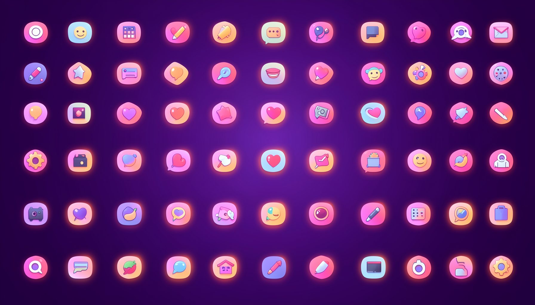
Browse by category
Icons are grouped into 19 categories, from everyday app and business icons to travel, music and user-interface glyphs.
Categories
Apps, Business, Communication, Design, E-commerce, Entertainment, Finance, Holidays & Events, Internet, Media, Miscellaneous, Music, News, Photography, Social, Technology, Travel, User Interfaces, Video.
License & Subscribe
Licensing terms cover use of both free and premium icons in personal and commercial work. Subscribers received email updates on new icon posts, with an RSS feed also available.

Get in touch
Questions, information or icon suggestions could be sent to contact.psdicons@psdicons.net, with replies typically arriving in 1–2 days.
𝕏