A collection of icons for designers and developers, organized by category and ready to drop into any project.
Designing Responsive Icons That Scale Gracefully
Icons need to remain recognisable when they move between a phone interface, a desktop dashboard, a presentation slide and a printed mock-up. Designing responsive icons that scale gracefully requires more than exporting the same artwork at several sizes. It involves clear geometry, controlled detail, consistent optical weight and file formats that support practical production workflows.
For Australian designers, this flexibility matters across a broad digital market. An icon may appear on a compact mobile screen used during a Sydney commute, a bright outdoor display in Perth or a web application accessed through slower regional connections. A carefully prepared icon system helps every interface feel coherent, accessible and dependable.
Start with a clear visual idea
Every icon should communicate one primary action, object or concept. At small sizes, a simplified symbol usually performs better than a detailed illustration. Begin with the essential silhouette, then remove decorative elements that do not improve recognition.
Use familiar visual conventions where appropriate. A magnifying glass can represent search, while a house can indicate a home screen. For less obvious subjects, support the symbol with a label or tooltip rather than forcing too much meaning into a tiny graphic.
Build on a consistent grid
A grid gives an icon family a shared structure. Define the canvas, keyline shapes, padding and alignment rules before drawing individual symbols. Common proportions make a collection feel deliberate, even when the icons represent very different categories such as finance, travel and social media.
Pay close attention to the optical centre. Geometric centring does not always look balanced: a circular object may need slightly different spacing from a square object, and diagonal shapes can appear lighter than vertical ones. Test icons beside one another at their intended display size instead of relying only on zoomed-in artwork.
Control detail across sizes
Responsive icons benefit from a small range of deliberate variants. A large version can include secondary shapes, subtle cuts and internal detail, while a compact version should preserve only the strongest identifying features. This approach is often called responsive iconography or progressive simplification.
Design at the smallest important size early in the process. If a symbol works at 16 or 20 pixels, it is easier to expand it for larger screens. Avoid thin strokes, narrow gaps and tiny counters that disappear when an icon is rasterised or viewed on a low-resolution display.
Choose flexible file formats
Editable PSD source files are useful when a designer needs to adjust colour, stroke weight, alignment or layer visibility. Keep shapes organised, name layers clearly and preserve vector-based elements wherever possible. Separate background, outline and detail layers so the icon can be adapted without rebuilding the artwork.
Transparent PNG files are convenient for websites, presentations and mock-ups, particularly when a project needs a quick raster asset. Export several pixel densities when required, and check the edges against both light and dark backgrounds. For interface products, also consider whether SVG or another scalable format is needed alongside PSD and PNG assets.
Test contrast and accessibility
An attractive icon can still fail if users cannot distinguish it from its background. Test colour combinations using adequate contrast, especially for navigation controls, status indicators and financial dashboards. Do not communicate meaning through colour alone; pair colour with shape, text, pattern or position.
Australian digital teams should consider the Disability Discrimination Act 1992 and the accessibility expectations commonly applied to public-facing services. Government and enterprise projects frequently use WCAG principles as a practical benchmark. Icons should have meaningful labels, suitable focus states and enough surrounding space for touch interaction.
Test the same assets on an Android phone, an iPhone, a desktop browser and a tablet. A commuter using a phone on a Melbourne tram may need a larger touch target, while someone reviewing a dashboard on a wide monitor may notice inconsistent alignment. Real device checks reveal problems that a design application can hide.
Prepare icons for real projects
A useful icon set includes clear naming, consistent export sizes and sensible variations. Organise files by subject or function, such as business, technology, user interface and travel. Include monochrome and colour versions when the collection is likely to serve several brands or product teams.
Think about local use cases during testing. Australian shoppers may browse an online store on mobile, compare services between Sydney and Brisbane, or access a web app while travelling through regional areas. Interfaces should load efficiently, remain legible in strong sunlight and avoid unnecessary visual complexity.
A well-prepared library also supports faster handover between designers and developers. PSD Icons collections can provide editable PSD artwork for customisation and transparent PNG assets for immediate placement in websites, presentations and prototypes. Check licensing terms, retain original proportions and document any changes made for a specific product.
Build a small test page before final delivery, placing each icon beside labels, buttons and form controls. Review it at common breakpoints and at different browser zoom levels. This simple step confirms whether the icon system remains cohesive when it leaves the design file and enters everyday use.
Explore PSD Icons for free collections and premium icon packs that can strengthen your next interface, mock-up or presentation. Download the formats that suit your workflow, adapt the editable artwork to your brand and subscribe for updates when new icon resources are released.
Ultimate Flat Social Icon Set
A premium pack of 70 icons delivered in PSD and PNG, across 4 sizes and 2 different styles, with an HTML/CSS3 version included.
It was built to complement the free library for projects needing a consistent, flat social icon set.
Browse by category
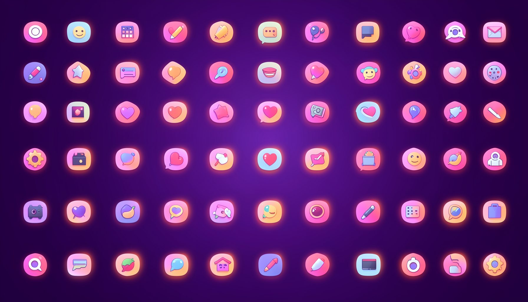
Icons are grouped into 19 categories, from everyday app and business icons to travel, music and user-interface glyphs.
Categories
Apps, Business, Communication, Design, E-commerce, Entertainment, Finance, Holidays & Events, Internet, Media, Miscellaneous, Music, News, Photography, Social, Technology, Travel, User Interfaces, Video.
License & Subscribe
Licensing terms cover use of both free and premium icons in personal and commercial work. Subscribers received email updates on new icon posts, with an RSS feed also available.

Get in touch
Questions, information or icon suggestions could be sent to contact.psdicons@psdicons.net, with replies typically arriving in 1–2 days.
𝕏