A collection of icons for designers and developers, organized by category and ready to drop into any project.
How to Use Layer Styles for Glossy Icons
Glossy icons bring a polished, tactile quality to digital interfaces. Their highlights, soft reflections and rounded shadows can make a flat symbol feel like a glass button, a lacquered badge or a polished app control. In Photoshop, layer styles provide a flexible way to build this appearance without painting every effect manually.
The technique works particularly well with PSD vector icons because each shape remains editable. You can adjust the colour, scale, bevel depth and lighting direction while keeping the original artwork intact. Transparent PNG exports then make the finished icons easy to place in websites, applications, presentations and mockups.
For Australian designers, this style suits everything from a fintech dashboard in Sydney to a travel app aimed at visitors exploring the Great Ocean Road. A carefully built glossy icon set can also help a small Melbourne studio or a Brisbane start-up create a consistent visual identity without spending hours recreating effects.
Prepare A Clean Icon Base
Begin with a simple, well-defined silhouette. Open the PSD file and place the icon shape on its own layer, preferably as a vector shape or smart object. Remove stray points and check that the edges are smooth at both small and large sizes. Glossy effects expose irregularities, especially around tight corners and narrow details.
Choose a strong base colour before adding shine. Saturated blues, greens and purples often produce a convincing glass or enamel appearance, while charcoal, navy and burgundy create a more premium finish. Avoid pure white as the base because it leaves little room for visible highlights and tonal variation.
Duplicate the original layer and keep a hidden copy untouched. This gives you a reliable fallback when experimenting with bevels, gradients or blending modes. Rename layers clearly, such as “Base Shape”, “Highlight” and “Reflection”, so another designer can edit the file quickly.
Build Depth With Bevel And Emboss
Open the Layer Style panel and activate Bevel & Emboss. Select Inner Bevel with a smooth contour, then use a relatively low depth and moderate size. The exact values depend on the icon’s dimensions, but subtle settings usually look more professional than an exaggerated 3D treatment.
Set the highlight colour to a soft white and reduce its opacity. Use a darker version of the base colour for the shadow rather than flat black. Keep the light direction consistent across the entire collection; a highlight falling from the upper-left corner is a dependable choice for interface icons.
The Gloss Contour setting controls how the light rolls across the edge. A curved contour can create a rounded, coated surface, while a sharper contour suggests hard plastic or glass. Preview the result at the final display size, since a bevel that looks refined at 400% may become muddy at 32 pixels.
Add Reflections And Surface Shine
Create a separate layer above the base and clip it to the icon’s shape. Use the Pen Tool, an ellipse or a soft brush to draw a curved reflection across the upper section. Fill the shape with white, lower its opacity and apply a layer mask or vector mask to keep it inside the icon.
A gradient overlay can add a smooth transition from bright to dark. Set the gradient to run diagonally or follow the icon’s perspective, then test Screen or Overlay blending modes. Screen is useful for clean light, while Overlay preserves some of the underlying colour and gives the surface greater depth.
For a glass-like finish, add a narrow secondary highlight near the main reflection. Keep it restrained: too many white streaks can make a symbol resemble wet plastic rather than a polished interface element. A subtle inner shadow around the lower edge helps separate the bright top from the darker underside.
Keep The Style Consistent
Create a reusable style by saving the layer effects as a Photoshop style or by grouping the icon layers inside a smart object. This makes it easier to apply the same visual language to business, finance, technology and social media symbols in a larger collection.
Consistency depends on more than identical settings. Compare the apparent light source, corner softness, reflection angle and shadow strength across every icon. A glossy dollar symbol should feel as though it belongs beside a glossy calendar or location pin, even when their silhouettes are very different.
When preparing assets for a local Australian product, test the icons in realistic settings. A banking interface used by customers in Perth may need strong contrast under bright daylight, while an event app for Melbourne may use a darker presentation with luminous highlights. Check accessibility and avoid relying on shine alone to communicate meaning.
Export Flexible Files For Digital Projects
Keep the master artwork in PSD format with editable vector layers and named effects. This is valuable for future colour changes, responsive interface work and client revisions. Smart objects can preserve the original proportions while allowing several size variations to share one source.
Export transparent PNG files at the sizes your project requires. Inspect the edges against both light and dark backgrounds, as faint halos can appear when a white highlight is softened against transparency. For web and app use, check that the file dimensions, colour profile and compression meet the developer’s requirements.
Useful production checks include:
- Keep a layered PSD master and a separate export folder.
- Test icons at 16, 24, 32 and 64 pixels where relevant.
- Use transparent PNG files when the background will change.
- Check contrast for Australian outdoor and mobile viewing conditions.
- Save a consistent light direction across the full icon family.
- Preview the assets inside a real interface, not only on the Photoshop canvas.
PSD Icons provides a practical starting point for this workflow, with free collections for testing ideas and premium packs for broader project coverage. Designers can download editable PSD vector artwork, refine the layer styles and export matching PNG files for mockups, websites and applications.
Build one base icon first, then turn its bevel, gradient, reflection and shadow treatment into a repeatable system. Once the style feels balanced, apply it across a complete set and publish the finished assets with clear file names and sizes. Browse PSD Icons to find a suitable icon collection and start creating a glossy visual language for your next digital project.
Ultimate Flat Social Icon Set
A premium pack of 70 icons delivered in PSD and PNG, across 4 sizes and 2 different styles, with an HTML/CSS3 version included.
It was built to complement the free library for projects needing a consistent, flat social icon set.
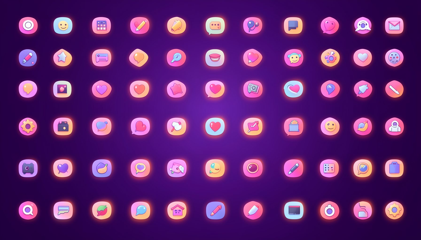
Browse by category
Icons are grouped into 19 categories, from everyday app and business icons to travel, music and user-interface glyphs.
Categories
Apps, Business, Communication, Design, E-commerce, Entertainment, Finance, Holidays & Events, Internet, Media, Miscellaneous, Music, News, Photography, Social, Technology, Travel, User Interfaces, Video.
License & Subscribe
Licensing terms cover use of both free and premium icons in personal and commercial work. Subscribers received email updates on new icon posts, with an RSS feed also available.

Get in touch
Questions, information or icon suggestions could be sent to contact.psdicons@psdicons.net, with replies typically arriving in 1–2 days.
𝕏