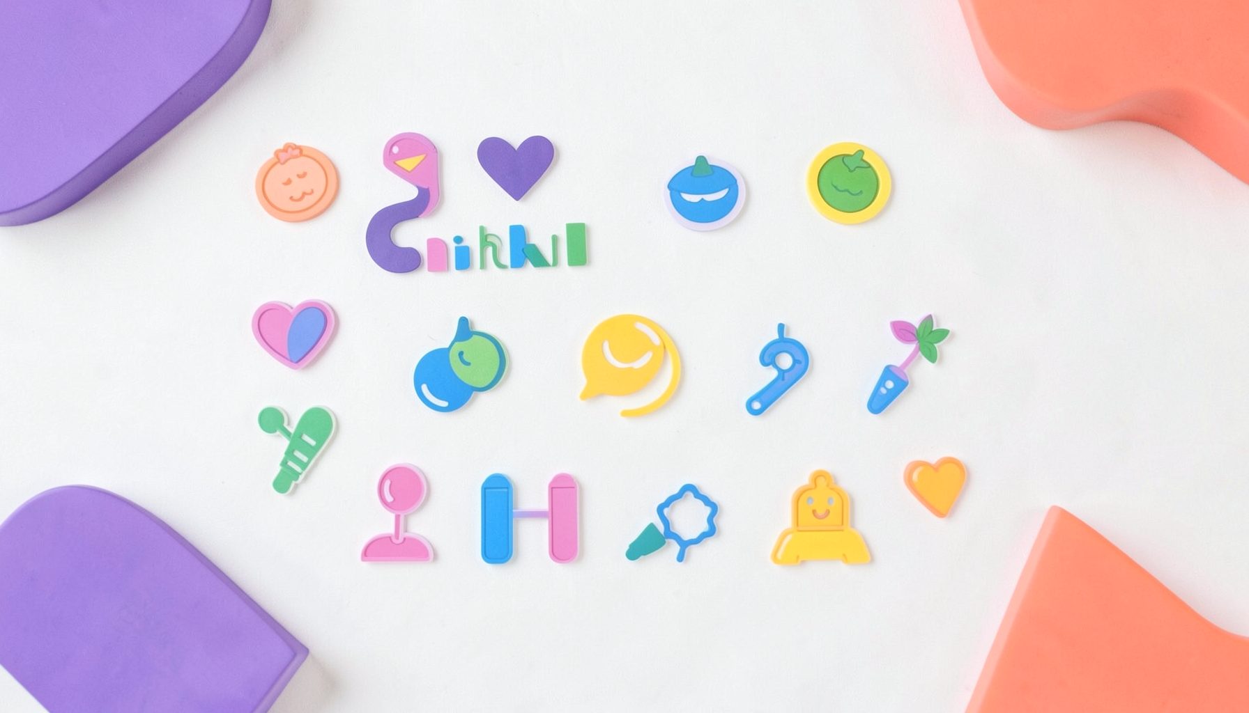
A collection of icons for designers and developers, organized by category and ready to drop into any project.
Creating a distinct visual voice with abstract icons
Abstract icons give brands a visual shorthand for ideas that cannot be explained by a single picture. Designing abstract icons for conceptual branding is about choosing which qualities become recognisable: trust, momentum, openness, precision or imagination. A successful symbol can communicate without a label, yet still feel connected to the organisation using it.
This is useful for Australian businesses, from a Melbourne coffee roaster to a Sydney fintech, that need a coherent identity across apps, websites, presentations and packaging. Distinctive geometry can give a compact organisation a professional presence without imitating the resources of a household name. It also offers designers a reusable library rather than a collection of unrelated decorative marks.
Begin with meaning, not style
Start by naming the concept in one or two words, then define how it should behave. Trust might use balanced proportions and stable, centred forms. Exploration might use open edges and directional angles. This prevents an attractive shape from carrying an ambiguous message, particularly when the icon appears without explanatory copy.
Translate those behaviours into repeatable devices: overlapping outlines for connection, tapered strokes for movement or open counters to suggest access. One device can produce many related icons, creating consistency while keeping each subject recognisable. A business set and a travel set can share a geometric grammar without looking interchangeable.
Context should guide that grammar. An icon for a reef-tourism operator near Cairns may need to feel calm and natural, while a resources company may need a more precise, engineered character. Where work engages with Aboriginal and Torres Strait Islander cultures, involve the relevant artists and communities rather than treating traditional motifs as a generic source of shapes.
Build a recognisable geometric language
Choose a limited geometry that your team can reproduce reliably: circles, rounded rectangles, consistent line weights and a defined corner radius. Draw the rules on a grid, including the space around each form. Consistent negative space often does more for recognition than another detail, and it keeps symbols legible when they shrink into an app navigation bar.
Reduce each idea until one dominant gesture remains. Three overlapping diamonds might communicate collaboration; a set of twelve could communicate complexity. Test whether the reduced form still feels related to the intended concept. If every mark needs a paragraph of explanation, it is probably too literal or too detailed for the format.
Give the system a recognisable silhouette without creating an accidental resemblance. Check new marks against prominent Australian and international identities before release, especially when simple forms could look like a wordmark or corporate monogram. Distinctiveness should come from deliberate rules, not an unfamiliar visual quirk that audiences cannot interpret.
Use colour and scale with purpose
Colour should reinforce the idea, not carry it alone. A monochrome set gives a brand flexibility across print, screen and merchandise, while an accent version can mark priority actions. In a fintech interface, an abstract transfer symbol must remain clear in grey, black and brand colour without losing its meaning.
Test the artwork at the sizes it will occupy, including 16, 24 and 32 pixels, and on both bright and dim screens. Thin gaps can close, counters can fill, and a balanced composition can become lopsided when compressed. Regular checks preserve the clarity that made the concept worthwhile.
Pair the testing with a sensible export plan. Transparent PNG files suit quick placement in mockups, slides and web graphics, while editable Photoshop PSD files let designers adjust colour, spacing or individual layers for a campaign. This balance makes an abstract set practical for a launch rather than merely impressive in a presentation.
Prepare the set for real brand use
Give each icon a descriptive name based on its function, not its appearance, so teams can find it easily in a shared library. Record the grid, stroke weight, minimum size, permitted colours and clear-space rules. These details matter when an agency, an in-house designer and a developer extend the same identity.
Consider moments when an icon carries a legal or commercial message. Australian consumers are regularly warned by the Competition and Consumer Commission about impersonation scams, so a financial-services symbol should never disguise an official-looking warning. A clean abstract shape can support a fraud alert, but it must not be confused with a regulator’s mark.
Include interface states such as default, selected, disabled and error without changing the core silhouette. Also check whether symbols remain understandable without labels for international audiences. Canberra-based public-sector and community organisations can benefit from a restrained set, but restrained does not have to mean impersonal or vague.
Find the right collection for your concept
Explore the free and premium icon sets at PSD Icons to compare different levels of abstraction, detail and consistency within a complete library. Free collections offer a practical way to compare approaches before committing, while premium packs provide broader coverage for launches needing many related assets across business, technology, finance, travel, social media and user interface projects.
Choose files that suit the production workflow. Layered Photoshop PSD vector artwork remains editable for original compositions, and transparent PNG files provide ready-to-place assets for websites, applications, mockups and presentations. The right package offers control and convenience without forcing every project into the same format.
Download a free set at PSD Icons, select a premium collection for a fuller visual family, or subscribe for email updates on new releases.
Ultimate Flat Social Icon Set
A premium pack of 70 icons delivered in PSD and PNG, across 4 sizes and 2 different styles, with an HTML/CSS3 version included.
It was built to complement the free library for projects needing a consistent, flat social icon set.
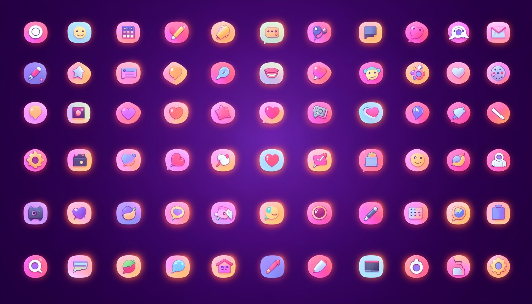
Browse by category
Icons are grouped into 19 categories, from everyday app and business icons to travel, music and user-interface glyphs.
Categories
Apps, Business, Communication, Design, E-commerce, Entertainment, Finance, Holidays & Events, Internet, Media, Miscellaneous, Music, News, Photography, Social, Technology, Travel, User Interfaces, Video.
License & Subscribe
Licensing terms cover use of both free and premium icons in personal and commercial work. Subscribers received email updates on new icon posts, with an RSS feed also available.

Get in touch
Questions, information or icon suggestions could be sent to contact.psdicons@psdicons.net, with replies typically arriving in 1–2 days.
𝕏