A collection of icons for designers and developers, organized by category and ready to drop into any project.
Best Practices for Icon Placement in Mobile UIs
A well-placed icon can make a mobile interface feel immediately familiar. It helps people scan a screen, recognise an action and move through an app without stopping to decode every label. Poor placement creates the opposite effect: missed controls, accidental taps and a frustrating sense that the interface is working against the user.
Mobile screens leave little room for decorative elements. Every symbol competes with text, navigation, notifications and touch targets, so placement needs to support the user’s next action. A bin icon belongs near the item it removes, while a search symbol should remain easy to find without crowding the main navigation.
Australian users move between bright outdoor conditions, slow rural connections and busy urban commutes. Someone checking an app on a Sydney train, ordering lunch in Melbourne or using a service in regional Queensland may have very different levels of attention, screen glare and connection quality.
The strongest mobile layouts use familiar symbols, consistent spacing and clear visual priority. Whether you are designing a finance app, travel service or business dashboard, a carefully organised icon set can improve usability while giving the product a polished, trustworthy appearance.
Place Icons Near The Action
An icon should sit close to the control, object or information it represents. If a card displays a booking, the calendar, edit and delete actions should be grouped within that card rather than placed in a distant toolbar. This relationship reduces visual searching and helps users understand which item an action will affect.
Keep primary actions in predictable positions. A back arrow generally belongs in the upper-left area for left-to-right interfaces, while a persistent navigation bar usually sits along the bottom edge. Australian users are familiar with these conventions across banking, shopping and government services, so breaking them requires a strong reason and clear supporting labels.
Touch targets need enough space even when the visible icon is small. Aim for a generous interactive area around each symbol, with sufficient separation to prevent mistaken taps. This matters when someone is walking through a Brisbane shopping centre or using a phone one-handed on a crowded tram.
Build A Clear Visual Hierarchy
Not every icon deserves equal emphasis. Primary actions can use a filled or higher-contrast treatment, while secondary actions may use an outlined style. Reserve bright accent colours for meaningful actions such as confirming a payment, starting navigation or submitting a form.
Avoid using colour as the only signifier. A pale icon may disappear in Australian sunlight, particularly on a beach in Perth or an outdoor café in Adelaide. Pair colour with shape, position or a short label, and check the interface in both light and dark modes.
Icons should also align with the typography and spacing system. A bold interface paired with delicate line symbols can feel disconnected, while oversized icons may push useful content below the fold. Designers exploring broader visual references can browse creative design resources before settling on a consistent direction for the product.
Useful hierarchy checks
- Highlight one primary action per screen
- Keep secondary controls visually quieter
- Test symbols in bright and dim conditions
- Pair unfamiliar icons with short labels
Use Familiar Symbols With Context
Common symbols such as home, search, settings and notifications are usually understood without explanation. More specialised icons require context. A lightning bolt might mean speed, electricity, a promotion or an automated feature, so its meaning should be reinforced by nearby text or a tooltip.
Do not rely on a symbol simply because it looks attractive. A three-dot menu can indicate more options, but users may not know whether it opens settings, sharing tools or account actions. Labels are especially valuable in financial and healthcare interfaces, where ambiguity can lead to costly mistakes.
Icon style should remain consistent across the whole product. Match stroke width, corner radius, perspective and visual weight. Mixing glossy illustrations with flat interface symbols makes the screen feel assembled from unrelated sources rather than designed as one system.
Design For Accessibility And Local Conditions
Icon placement should work with screen readers, magnification and alternative input methods. Add accessible names to actionable icons, ensure focus states are visible and avoid placing controls so close together that keyboard or switch users cannot distinguish them.
Text labels also help people who are new to a service, older users and anyone working in a second language. This is particularly relevant for Australian products serving multilingual communities in Sydney, Melbourne and Western Sydney. A familiar icon can support comprehension, but it should not replace essential wording.
Check contrast against the backgrounds users will actually encounter. Australians may use mobile services in harsh midday light, during a power outage caused by severe weather or on an unreliable regional connection. Compressed images and slow loading should not leave empty gaps that make controls appear misplaced.
Accessibility checks before release
- Provide a meaningful accessible label for each action
- Confirm contrast in light and dark themes
- Keep tap areas separate and easy to identify
- Test with zoom, screen readers and reduced motion
Choose Assets That Scale Cleanly
Vector-based icons are useful because they remain sharp across different screen densities and device sizes. Exported PNG files can support specific interface states, but they should be produced at the required resolutions and checked for blurry edges, unwanted padding and inconsistent transparency.
A well-organised asset library speeds up collaboration between designers and developers. Name icons clearly, include active and inactive states, and document which symbols are approved for navigation, actions and notifications. A collection from the PSD icon library can provide a practical starting point for projects that need editable PSD vectors alongside transparent PNG files.
Before shipping, inspect the interface on compact phones, large phones and tablets. Check portrait and landscape layouts, safe areas around camera cut-outs and the behaviour of bottom navigation when the on-screen keyboard appears. Consistency across these situations matters more than making a single mock-up look perfect.
Good icon placement is a small discipline with a large effect on confidence. Keep controls close to their targets, make primary actions obvious, provide labels where meaning is uncertain and test under real Australian conditions rather than relying only on a desktop preview.
Build a small, consistent icon system, review it with users and refine the spacing before development is complete. When the right symbols appear in the right places, mobile interfaces become easier to scan, faster to learn and far less likely to produce accidental taps.
Ultimate Flat Social Icon Set
A premium pack of 70 icons delivered in PSD and PNG, across 4 sizes and 2 different styles, with an HTML/CSS3 version included.
It was built to complement the free library for projects needing a consistent, flat social icon set.
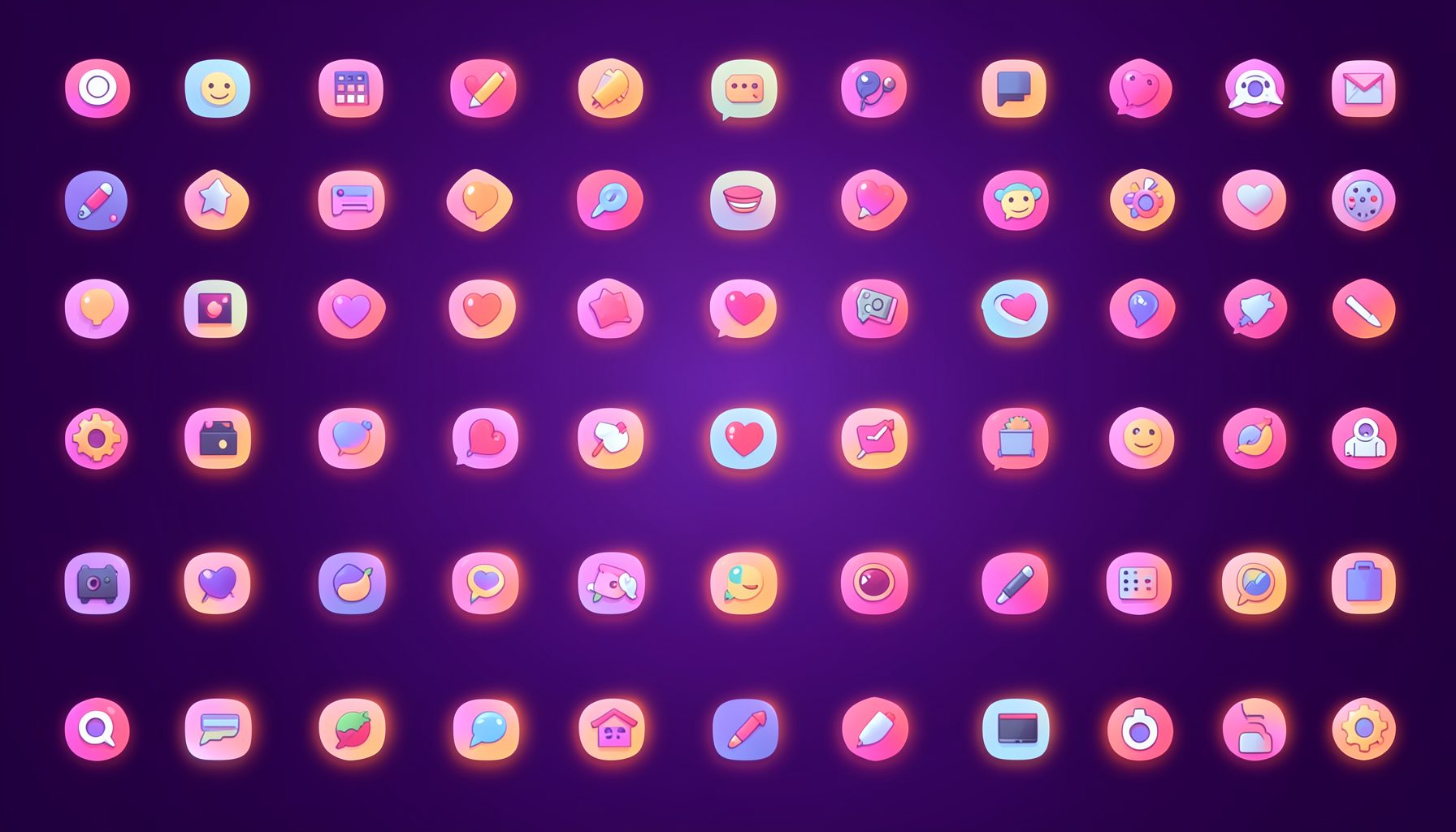
Browse by category
Icons are grouped into 19 categories, from everyday app and business icons to travel, music and user-interface glyphs.
Categories
Apps, Business, Communication, Design, E-commerce, Entertainment, Finance, Holidays & Events, Internet, Media, Miscellaneous, Music, News, Photography, Social, Technology, Travel, User Interfaces, Video.
License & Subscribe
Licensing terms cover use of both free and premium icons in personal and commercial work. Subscribers received email updates on new icon posts, with an RSS feed also available.

Get in touch
Questions, information or icon suggestions could be sent to contact.psdicons@psdicons.net, with replies typically arriving in 1–2 days.
𝕏