A collection of icons for designers and developers, organized by category and ready to drop into any project.
Designing line icons for minimalist UI themes
Minimal interfaces depend on symbols that stay clear at small sizes. A clean outline can signal navigation, status or action without visual weight, but consistency matters more than ornament. When icons share a rhythm, users recognise the system faster and screens feel calmer across dashboards, apps and websites.
For designers and developers, the practical challenge is moving from a convincing drawing to a dependable asset. PSD Icons supports that path with editable Photoshop vector files and transparent PNG previews, while free collections and expanded premium packs offer quick starts and specialised coverage for business, technology, finance, travel and interface projects.
Establish a consistent visual language
A shared visual language begins with rules. Choose one outline style, a consistent corner treatment and familiar metaphors before drawing individual symbols. The same home, search or settings concept should not jump between a rounded house, a sharp house and a filled house from one screen to the next.
Line icons benefit from a limited vocabulary. Prefer a simple magnifier to a detailed glass with tiny lettering, and represent notification with a dot or bell rather than a text-filled badge. This restraint keeps symbols legible in navigation bars, compact cards and dense tables where extra strokes quickly become noise.
A useful review method is to place candidate icons beside real interface copy. Check the balance between words and symbols, then decide whether each shape communicates without explanation. A technically accurate drawing can fail if it needs a label to make sense, while a reduced mark can work across several products.
Draw on a disciplined grid
Begin with a square construction grid, commonly 16, 20 or 24 pixels for interface sets, and align every edge to that system. Circles should sit fully inside the grid, while optical centring may require a small visual adjustment because a mathematically centred shape can appear off-centre beside text.
In Photoshop, separate the path, stroke and colour into editable layers. Keep the artboard and export area predictable, avoid clipping strokes at the edges, and document the intended pixel size. These conventions reduce disruption when a developer or another designer joins the project.
Icon grids should suit their context rather than act as rigid formulas. A mobile tab bar may need a larger working area than a 16-pixel toolbar, and a dashboard control may sit beside heavier type. Test the set at the smallest and largest expected sizes to identify shapes that become vague when reduced.
Tune weight, spacing and detail
Stroke weight gives a line set its character. If most icons use a two-pixel stroke, a one-pixel detail will disappear on low-density displays; if one icon uses four, it may dominate the group. Establish a primary weight, allow a double stroke for emphasis and protect narrow forms with a minimum gap.
Spacing needs the same discipline. Leave enough negative space around complex symbols without making them look undersized beside simpler ones. Optical balance often beats perfect geometry, especially for arrows, clocks and location pins. Compare the silhouettes as a group, then inspect individual icons against their likely backgrounds.
Detail should follow display size. Tiny internal marks can blur on mobile screens, so remove or simplify them before shrinking the artwork. Test on light and dark surfaces, since a thin outline that feels delicate on white can vanish on black. Rounded caps often feel friendly, while square caps create a more technical character.
Localise the experience for Australia
Australian products need more than a generic English set. Use Australian spelling, local date conventions, the Australian dollar and the international phone format where relevant, then verify icons against services people actually use. A transport symbol for a journey through Sydney Harbour or a tram icon for Melbourne should match the local context without substituting a landmark for meaning.
Local voice can shape labels and supporting copy. Informal terms such as “arvo” may suit a consumer brand or event app, while “no worries” works in some service contexts but can feel out of place in financial or enterprise software. Match the tone to the audience, test it with Australian users and avoid turning a few expressions into stereotypes.
For Australian gaming interfaces, readability is especially valuable when people compare time-sensitive options. Pages about fastest poker AU dollars show why a clear label and a recognisable clock or chip symbol can help users scan quickly. The same principle supports quick decisions in Australian betting and banking products.
Build assets that survive production
Production-ready source files should make handoff predictable. In a PSD, name layers consistently, keep vectors editable and place transparent PNG exports in clearly sized folders. Include the original scale plus high-density versions, and record each icon’s intended use so a developer can match the correct weight.
Choose assets by the job they need to do. A free pack can suit a prototype or small marketing site, while a premium collection may offer broader categories, more variants and files that adapt across a product suite. Australian teams working across government, retail and financial services often need that flexibility. Review included formats and permitted uses, then keep the selection visually coherent rather than mixing packs at random.
Test final assets in the browser, native application and presentation tools used by the team. Confirm that PNG edges remain clean, focus states are visible and icon meaning survives localisation. Subscribe to email updates for new releases, reducing the chance that a growing product drifts into competing styles.
Start with a free collection from PSD Icons, compare its stroke treatment with your interface, and shortlist any gaps that justify a broader premium pack. A focused test project can reveal whether the icons remain balanced in navigation, forms and feature cards before the set reaches a wider release.
Build the library with a shared grid and naming structure, then download matching transparent PNGs for the assets your current workflow needs. Subscribe for release updates and add new icons only when they meet the established visual rules. That simple discipline gives minimalist Australian interfaces a clearer identity and a more consistent experience.
Ultimate Flat Social Icon Set
A premium pack of 70 icons delivered in PSD and PNG, across 4 sizes and 2 different styles, with an HTML/CSS3 version included.
It was built to complement the free library for projects needing a consistent, flat social icon set.
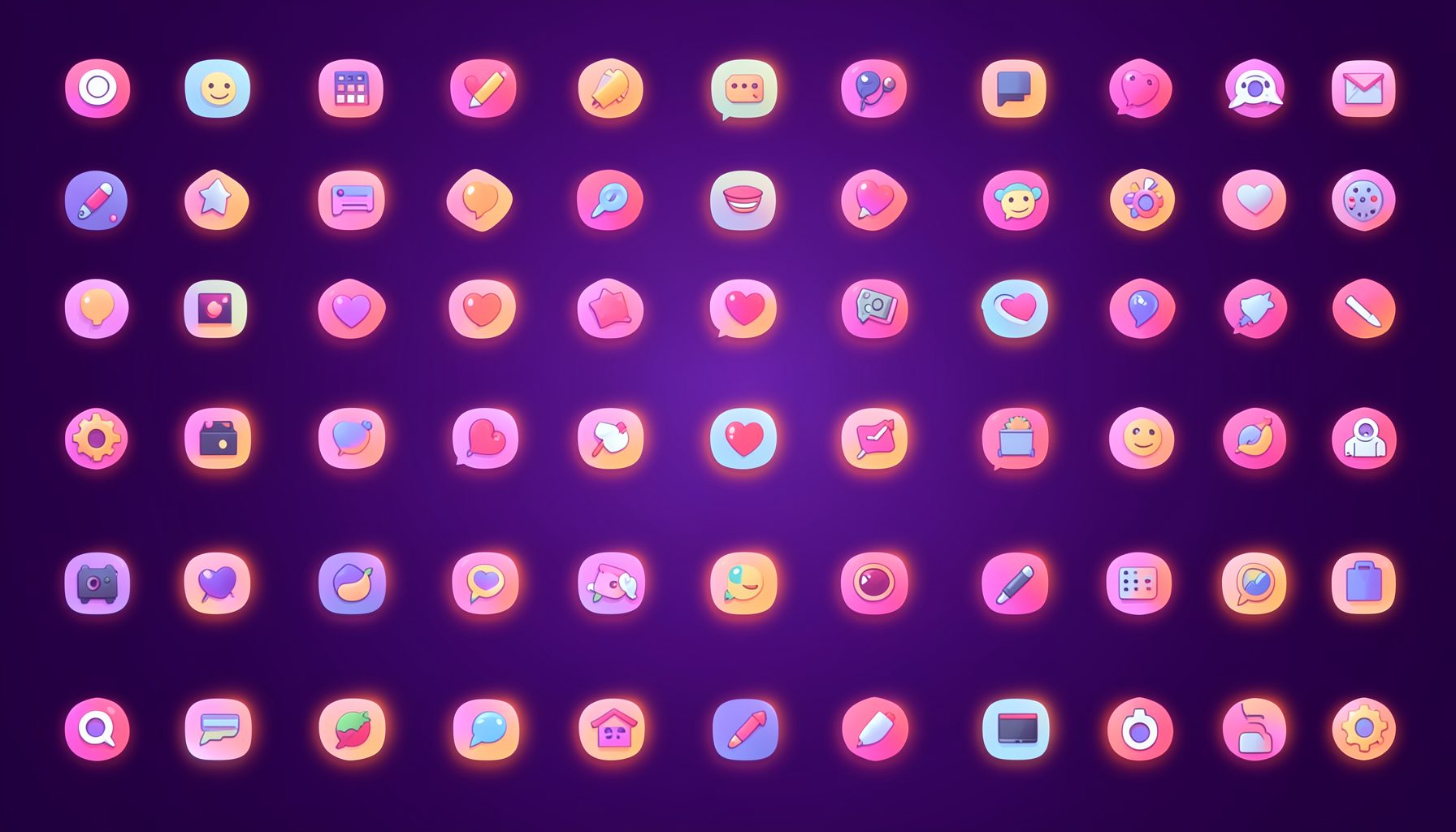
Browse by category
Icons are grouped into 19 categories, from everyday app and business icons to travel, music and user-interface glyphs.
Categories
Apps, Business, Communication, Design, E-commerce, Entertainment, Finance, Holidays & Events, Internet, Media, Miscellaneous, Music, News, Photography, Social, Technology, Travel, User Interfaces, Video.
License & Subscribe
Licensing terms cover use of both free and premium icons in personal and commercial work. Subscribers received email updates on new icon posts, with an RSS feed also available.

Get in touch
Questions, information or icon suggestions could be sent to contact.psdicons@psdicons.net, with replies typically arriving in 1–2 days.
𝕏