A collection of icons for designers and developers, organized by category and ready to drop into any project.
Designing minimalist icons for modern user interfaces
Minimalist icons for modern user interfaces work best when every curve, stroke and gap has a clear purpose. Simplicity is not the same as vagueness: a compact symbol must still communicate its action, object or status at a glance while fitting neatly beside labels, buttons and navigation patterns.
Designers in Sydney, Melbourne and Brisbane often work across mobile apps, customer portals and presentation decks with the same visual system. A disciplined icon family reduces repeated production, helps product teams speak consistently and gives polished mockups a unified finish without adding visual noise.
Start with a shared visual vocabulary
Begin with a unit, such as a 24-pixel grid, and define a consistent stroke weight, corner radius and level of detail. Even a small set of rules can prevent visual drift when icons come from different designers or source collections. The grid should accommodate the smallest expected size, while optical adjustments can correct symbols that appear heavier or lighter than their neighbours.
Create a short metaphor map for the interface rather than choosing icons one at a time. Decide which actions deserve symbols, which need plain-language labels and which concepts should remain text-only. Familiar metaphors such as a magnifying glass for search or a bell for notifications can shorten scanning, but an ambiguous symbol will cost users more effort than a short button label.
Reduce shapes without losing recognition
Reduction should happen through careful editing, not automatic simplification. Remove secondary highlights, soften unnecessary joins and shorten forms that fail at 16 or 20 pixels. Check the silhouette first: a recognisable outline often communicates better than fine internal detail, particularly on small mobile screens.
Australian products also benefit from language that feels direct and natural. Labels can use standard Australian English without forcing casual expressions into every control, while conversational supporting copy might include phrases such as “no worries” or “fair dinkum” where the tone suits the service. For government, banking or healthcare workflows, accuracy and clarity should take priority over personality.
Build icons for real interface states
An icon rarely exists in only one condition. Production files should account for default, hover, pressed, selected, disabled, error and loading states, with suitable colour or contrast changes for each one. A single source symbol can then be styled consistently instead of being redrawn for every platform, which also improves accessibility and makes updates easier to manage.
Design for the environments in which the product is actually used. A commuter checking a banking app on a crowded train may need stronger contrast and larger touch targets, while an administrator comparing finance data on a desktop may need compact symbols that align with dense tables. Test against real background colours, including dark mode, rather than relying on a light canvas in isolation.
Prepare editable assets for production
Layered PSD files provide the flexibility to adjust colour, stroke and geometry without rebuilding each symbol. Keep construction layers consistent, name components predictably and export transparent PNG files at the sizes required by the project. A well-organised source file saves time when an icon must be resized for a website, application, mockup or presentation.
PSD Icons organises resources into business, technology, finance, travel, social media and user-interface categories, with both free collections and expanded premium packs. For social products, a broad social icon collection can provide a useful baseline before the team trims and aligns assets to its own grid. Transparent PNG exports also make selected symbols easy to test inside interface mockups.
Validate locally and deliver a clear next step
Test icons with people who resemble the intended users, especially when visual conventions or wording could be unclear. Australian participants may respond well to straightforward instructions, but regional differences, age groups and digital confidence still shape comprehension. Ask participants to locate an action rather than describe the symbol; this reveals whether the intended meaning survives without explanation.
Commercial presentation matters in the Australian market as well. Make licences, file formats and permitted uses easy to compare, and consider whether pricing should be shown in Australian dollars with GST stated clearly. Free resources can support smaller projects, while premium bundles may suit agencies and product teams that need broader coverage, consistent source files and dependable export options.
Ready to build a cleaner interface? Visit PSD Icons, download a free collection or compare the premium packs, subscribe to email updates for new releases and test a suitable icon set in your next prototype before committing it to production.
Ultimate Flat Social Icon Set
A premium pack of 70 icons delivered in PSD and PNG, across 4 sizes and 2 different styles, with an HTML/CSS3 version included.
It was built to complement the free library for projects needing a consistent, flat social icon set.
Browse by category
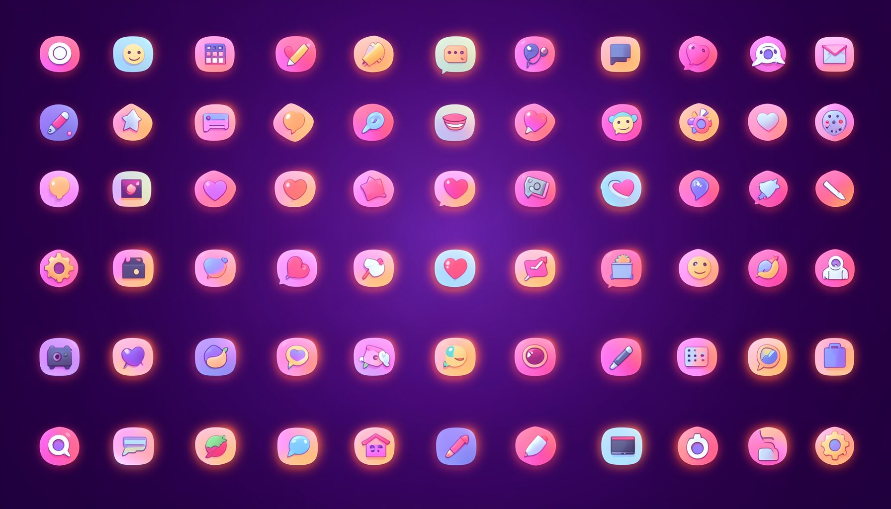
Icons are grouped into 19 categories, from everyday app and business icons to travel, music and user-interface glyphs.
Categories
Apps, Business, Communication, Design, E-commerce, Entertainment, Finance, Holidays & Events, Internet, Media, Miscellaneous, Music, News, Photography, Social, Technology, Travel, User Interfaces, Video.
License & Subscribe
Licensing terms cover use of both free and premium icons in personal and commercial work. Subscribers received email updates on new icon posts, with an RSS feed also available.

Get in touch
Questions, information or icon suggestions could be sent to contact.psdicons@psdicons.net, with replies typically arriving in 1–2 days.
𝕏