A collection of icons for designers and developers, organized by category and ready to drop into any project.
How to create a family of icons with unified themes
Creating a coherent icon family gives products a recognisable visual identity. Whether the assets appear in a booking app, business dashboard or travel website, consistent shapes and visual rules help users understand each symbol quickly. A unified theme also makes large collections easier for designers to maintain as an interface grows.
Australian products often serve audiences across Sydney, Melbourne, Brisbane and regional centres. Their interfaces may need symbols for public transport, local services, payments, property and social communication. These use cases differ from one another, yet the icons should feel like they belong to the same design system rather than a collection of unrelated graphics.
A practical workflow combines a clear grid, reusable components, disciplined exports and thorough testing. The source artwork should remain editable while finished files suit common screen sizes. Colour, stroke weight, corner radius and optical alignment need equal attention, since small inconsistencies become obvious when icons appear together.
PSD Icons offers free and premium collections in Photoshop PSD vector format, with transparent PNG files ready for websites, applications, mockups and presentations. These packs provide useful references for builders who want to study consistent spacing, naming and export practices before assembling their own icon library.
Set the shared visual language
Begin with the role of the family rather than a list of individual symbols. Identify the themes your product needs, such as business, technology, finance, travel, social media or user interface controls. Map each concept to common user actions, then group related icons into categories with shared subjects, dimensions and levels of detail.
Establish a simple visual grammar before drawing. A 24-pixel grid, two-pixel stroke, rounded line caps and a consistent corner radius offer a workable foundation for interface icons. Some collections need filled shapes instead, but mixing styles should follow a deliberate rule. Document the permitted combinations so later additions do not drift away from the original appearance.
Colour should support meaning rather than distract from the shape. A restrained palette makes state changes and background variation easier to handle, while sufficient contrast improves readability for users with low vision. For tools used outdoors or during daily commutes in Australia, test icons at small sizes and in bright ambient light as well as on a standard office monitor.
Build icons from reusable components
Construct the family from reusable vector components wherever possible. Shared circles, squares, lines, arrows and containers can become building blocks for more complex symbols. In Photoshop, keep these elements organised as shape layers, Smart Objects or clearly named groups so edits to a shared form update every affected icon.
Watch optical alignment as closely as geometric alignment. A house, envelope or shopping bag may need subtle shifts to appear centred within the same grid. Symbols with fine details often look visually heavier than broad shapes, so adjust their proportions while preserving a consistent stroke and corner treatment.
Travel and everyday service icons require particular care. Australian users may look for train, bus, tram, ferry, airport and taxi symbols, but proprietary transport logos should only be included with permission. Generic pictograms can represent familiar travel habits without tying the collection to a specific operator or city.
Prepare files for real-world use
Create a predictable folder structure and naming system for every asset. Include the category, concept, style, variant and size in each filename, then maintain the same logic inside the PSD. This approach makes replacement files easier to find and helps teams avoid using a 32-pixel export where a 16-pixel version is required.
Retain vector artwork in the PSD source and export transparent PNG files at the resolutions your product uses. Common interface sizes include 16, 20, 24, 32 and 48 pixels, while larger PNG exports can support presentations and marketing mockups. Check pixel alignment, transparency and antialiasing at each size instead of enlarging a single small export.
Local compliance belongs in the asset process as well. Under the Privacy Act 1988, interface symbols should not expose identifiable customer information or encourage insecure handling of personal data. Commercial releases should also state licence terms clearly and align pricing claims with Australian Consumer Law requirements. For Australian marketplaces, including GST information and Australian dollar values in product metadata helps customers understand the purchase.
Expand the family without breaking consistency
Add new icons through the same component library and style rules used for the original set. Create state variations such as default, hover, active, selected and disabled where an interface needs them. Keep visual changes consistent across every symbol, and use colour to reinforce a state only when colour is not the sole indicator.
A written style guide should record grid measurements, minimum sizes, stroke behaviour, corner radius, palette values and permitted background colours. It can also define naming conventions and accessibility guidance. This document becomes the reference for future contributors, especially when freelancers or in-house designers work across multiple products.
Different themes can remain visually unified without using identical metaphors. Business icons might depict invoices, teams and storefronts, while finance symbols cover payments, accounts and tax. The Australian market includes many small retailers, sole traders and service businesses, so practical concepts such as quotes, bookings and ABN details can be valuable when they are simplified into neutral interface symbols.
Test and release the collection
Review the finished family on light and dark backgrounds, at every intended size and in real interface layouts. Compare each icon beside its neighbours to reveal differences in weight, scale and spacing. Check that silhouettes remain distinguishable and that selected or disabled states are clear without relying on colour alone.
Run a practical usability review with people who represent the intended audience. Ask them to match icons with expected actions, then observe where they hesitate. Record the findings against specific assets, prioritise frequent interface elements and refine unclear forms before producing the final exports and documentation.
Package the editable PSD, transparent PNGs, preview sheets and concise usage guide into a release that other designers can adopt with confidence. Then explore the free and premium collections at PSD Icons, download a relevant starting point or choose an expanded pack, and subscribe to email updates when new releases match your design work.
Ultimate Flat Social Icon Set
A premium pack of 70 icons delivered in PSD and PNG, across 4 sizes and 2 different styles, with an HTML/CSS3 version included.
It was built to complement the free library for projects needing a consistent, flat social icon set.
Browse by category
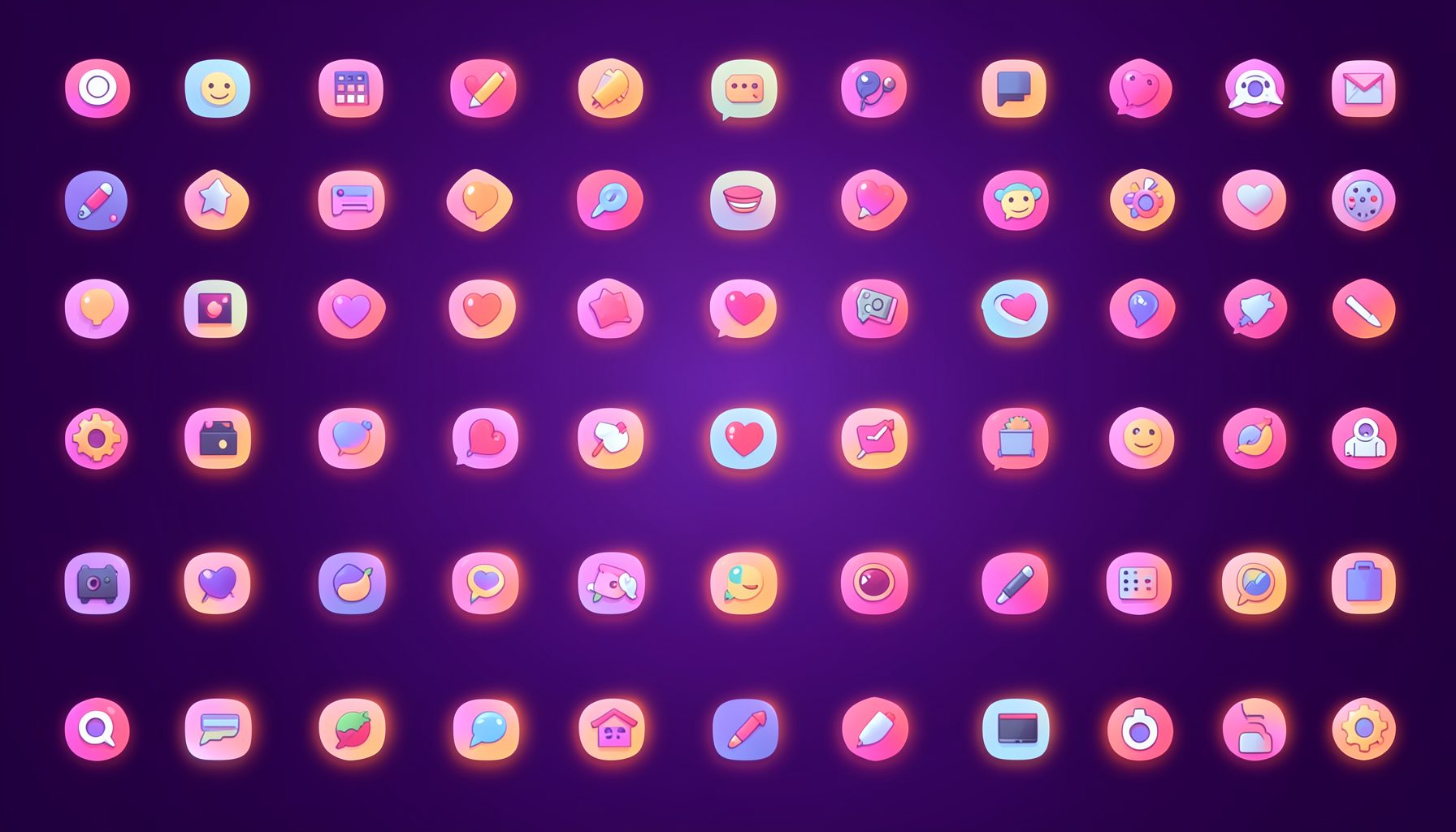
Icons are grouped into 19 categories, from everyday app and business icons to travel, music and user-interface glyphs.
Categories
Apps, Business, Communication, Design, E-commerce, Entertainment, Finance, Holidays & Events, Internet, Media, Miscellaneous, Music, News, Photography, Social, Technology, Travel, User Interfaces, Video.
License & Subscribe
Licensing terms cover use of both free and premium icons in personal and commercial work. Subscribers received email updates on new icon posts, with an RSS feed also available.

Get in touch
Questions, information or icon suggestions could be sent to contact.psdicons@psdicons.net, with replies typically arriving in 1–2 days.
𝕏