A collection of icons for designers and developers, organized by category and ready to drop into any project.
How to create custom icon sets in Photoshop from scratch
Custom icons give websites, applications and mockups a shared visual language. Building a Photoshop icon collection from scratch works best when every symbol starts with a clear job, a consistent grid and a defined export size, rather than a folder of unrelated drawings.
This workflow covers editable vectors, organised layers, transparent PNG exports and layered PSD packaging. It suits designers creating a small free collection or developers assembling a broader premium set.
Set a clear visual direction
Begin with a brief that explains what each icon must communicate, where it will appear and the smallest size it must support. Choose one visual character, such as outlined, filled or duotone, then set rules for corner shapes, stroke weight and detail.
For an Australian release, make the brief market-specific. A Sydney property app needs keys, map pins and trains; a Melbourne café flow may need takeaway coffee, bakery and tram symbols; a Brisbane delivery dashboard needs parcels and warehouses. Use A$ for Australian dollars and include GST where relevant, format dates day/month/year and offer Australia Day and ANZAC Day variants.
Build a grid that scales
Use a 24-pixel artboard with a two-pixel outer safe area as a practical master. Work on the pixel grid, align edges deliberately and design silhouettes that survive at 16, 20, 24 and 32 pixels. A simple symbol should remain understandable before decorative detail is added.
Create a layer structure that developers can navigate: one layer per icon, clearly named groups, separate shape and colour groups, and a shared guides layer. Consistent spacing and anchor positions make later corrections faster and reduce visual drift across the set.
Draw simple, recognisable vectors
Use Pen, Shape and Pathfinder tools to construct paths from basic geometry. Prefer rounded rectangles, circles and straight lines over irregular outlines, and use Boolean operations to cut clean negative spaces. Keep anchor points minimal so each symbol remains easy to recolour, resize and edit.
Apply a consistent stroke style through Photoshop layer styles or component shapes rather than tracing each outline separately. Check diagonal strokes, corner joins and tiny counters at target size, because details that look precise on a large artboard often clutter when exported.
Test each drawing as a silhouette first. If its meaning is unclear without colour or text, simplify the form, enlarge the main gesture or replace it with a more familiar metaphor. Strong iconography usually comes from reduction, not embellishment.
Apply colour and prepare exports
Define a small palette with a neutral base, primary action colour and optional accent. Check icons against light and dark interfaces, and make sure the meaning does not depend on colour alone. Pair colourful exports with monochrome versions for navigation bars, disabled states and accessibility needs.
Export transparent PNG files at the sizes promised in the product listing, using crisp edges where appropriate and antialiasing where curves require it. Keep the master artwork in a layered PSD with live vector shapes, and include an SVG export for modern web and application workflows.
An icon can outlive several interface redesigns, so treat it as a durable brand asset rather than disposable decoration. That long-term approach draws a useful parallel with sustainable keepsake design, where lasting usefulness influences the final result.
Test the set in real contexts
Place the icons into actual screens rather than judging them on an empty canvas. Check them in a Sydney-to-Melbourne booking flow, a Brisbane food-ordering dashboard and an Australian finance app. Verify that labels, spacing and selected states still work when the icons are small and surrounded by real interface elements.
Ask a developer to inspect layer names, export dimensions and file weight. Confirm that transparent edges display correctly, colours survive on common devices and the icons remain legible in greyscale. Screen-reader labels should be supplied separately because a graphic symbol cannot carry accessible meaning by itself.
Review Australian language and place references carefully. Use current community guidance when showing place names such as Naarm for Melbourne or Meanjin for Brisbane, and check whether product copy uses Australian spellings such as colour, organisation and licence. These small checks strengthen local relevance without turning the set into a collection of stereotypes.
Package the collection for release
PSD Icons offers free downloads and expanded premium packs across business, technology, finance, travel, social media and user-interface categories. Prepare a clear preview, concise usage notes and a predictable naming system so buyers can understand the offer before downloading anything.
A professional delivery package should include the following essentials:
- Keep a layered PSD with named groups and editable vector artwork.
- Export transparent PNG files in every advertised pixel size.
- Include a licence covering commercial use, editing and redistribution.
- Add mockup previews showing the icons in websites and applications.
After export, open every file on a second device and compare it with the source artwork. Remove hidden layers, duplicate files and accidental clipping masks, then archive the editable master separately from the compressed customer download.
Turn the first draft into a customer-ready release
Start with the twelve symbols needed for one real customer journey, test them at their smallest working size and refine the grid before expanding the collection. This creates a coherent foundation without delaying the first release.
Choose the appropriate format for your audience: a useful starter set with transparent PNGs, or a premium package with layered PSD files, extra styles and commercial terms. Publish it through a specialist catalogue such as PSD Icons, where visitors can browse related categories and receive email updates about new releases.
Draw the first twelve icons today, package them for PSD Icons and give your audience a consistent visual language they can use.
Ultimate Flat Social Icon Set
A premium pack of 70 icons delivered in PSD and PNG, across 4 sizes and 2 different styles, with an HTML/CSS3 version included.
It was built to complement the free library for projects needing a consistent, flat social icon set.
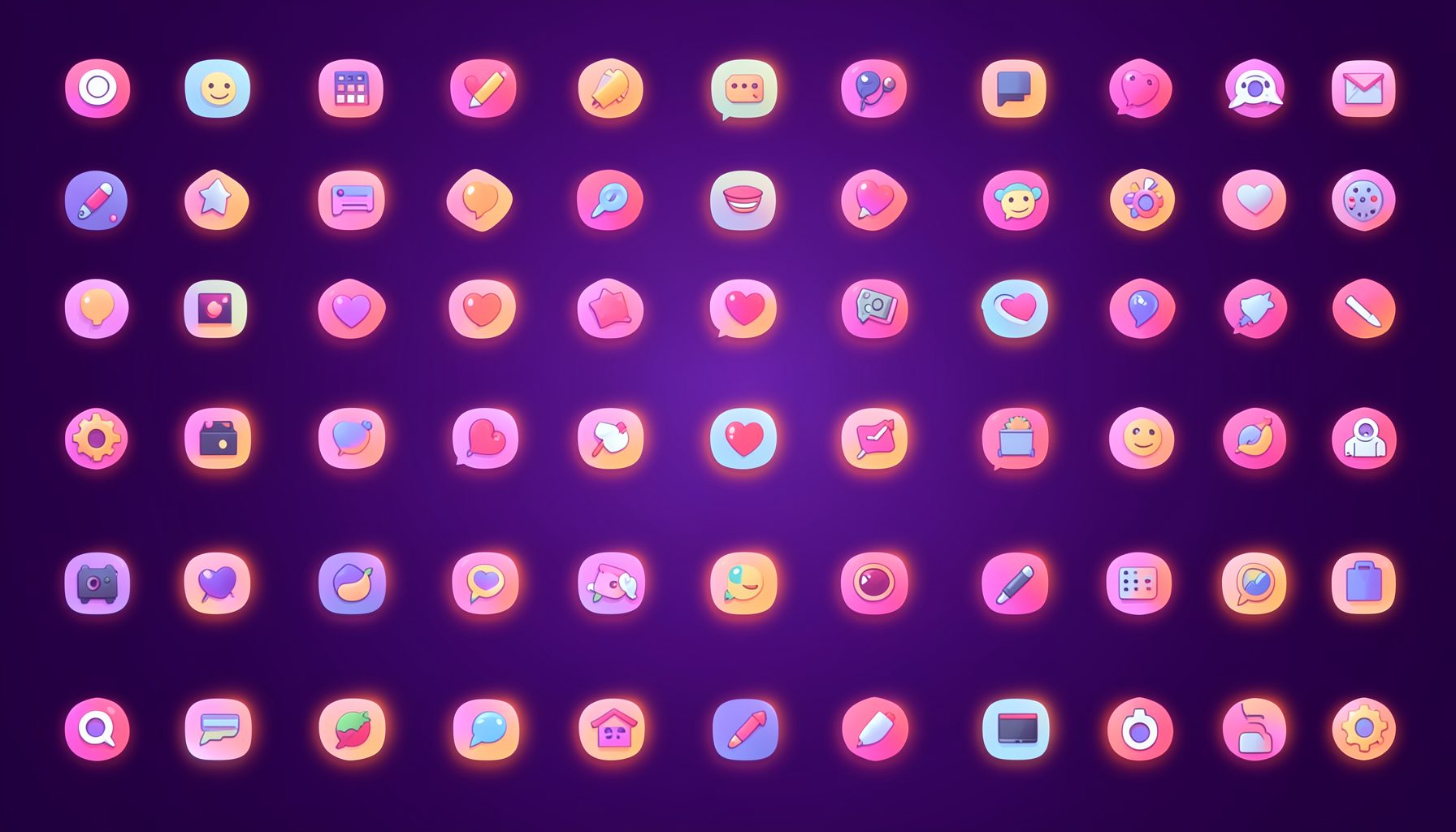
Browse by category
Icons are grouped into 19 categories, from everyday app and business icons to travel, music and user-interface glyphs.
Categories
Apps, Business, Communication, Design, E-commerce, Entertainment, Finance, Holidays & Events, Internet, Media, Miscellaneous, Music, News, Photography, Social, Technology, Travel, User Interfaces, Video.
License & Subscribe
Licensing terms cover use of both free and premium icons in personal and commercial work. Subscribers received email updates on new icon posts, with an RSS feed also available.

Get in touch
Questions, information or icon suggestions could be sent to contact.psdicons@psdicons.net, with replies typically arriving in 1–2 days.
𝕏