A collection of icons for designers and developers, organized by category and ready to drop into any project.
How to Manage Large Icon Sets with Photoshop Libraries
A large icon collection can quickly become difficult to search, update and share. Files with similar names may contain different line weights, colour treatments or canvas sizes, while duplicated assets consume storage and slow down everyday design work. Photoshop Libraries provide a practical way to organise these resources inside the applications where designers already build interfaces, mockups and marketing materials.
For Australian designers, a well-managed library is especially useful when projects move between freelance studios, in-house teams and developers working remotely across Sydney, Melbourne, Brisbane or Perth. A consistent system helps everyone find the right asset without sending large folders through email or searching through disconnected cloud drives. A useful design resource can also support broader decisions about visual organisation and digital production.
PSD Icons collections are suited to this workflow because they commonly include editable Photoshop PSD vector artwork alongside transparent PNG files. That combination makes it easier to keep a master version for changes while using lightweight exports in presentations, prototypes, websites and applications.
Build a clear library structure
Start by deciding how icons will be grouped before importing hundreds of assets. Useful categories might include business, finance, technology, travel, social media and user interface controls. Within each category, create separate groups for outline, filled, coloured and monochrome styles. This prevents a calendar icon with a thin stroke from sitting beside a visually incompatible solid version.
Use a predictable naming convention for every item. Names such as finance-card-outline, travel-map-filled and ui-chevron-left are easier to search than vague labels such as icon-final-2. Add size or state details only when they matter, such as notification-active or arrow-24px. Consistent names become increasingly valuable when Photoshop Libraries are shared with developers or imported into other design tools.
Keep related assets together in library groups rather than placing everything in one long list. A project library might contain brand icons, interface controls and approved illustrations, while a broader team library can hold the complete catalogue. This separation reduces accidental use of an unfinished asset and makes permissions easier to manage.
Prepare files before importing
Clean the source files before they enter the library. Check that PSD artwork uses sensible layer names, that vector shapes remain editable and that transparent PNG exports have no unwanted background pixels. Remove hidden test layers, unused swatches and duplicate artboards. A smaller, cleaner source file is easier to maintain over time.
Standardise the visual rules across a set. Confirm stroke widths, corner radii, alignment, optical spacing and baseline behaviour. Icons may occupy the same canvas but appear different in size if their visual weight has not been balanced. Test them at common interface sizes, including 16, 20, 24 and 32 pixels, before publishing the collection.
Separate master artwork from delivery files. Keep the PSD or vector-based source as the version used for revisions, then export transparent PNG files for quick placement in mockups and presentations. This approach protects editability while giving developers and clients ready-to-use assets. It also avoids repeatedly opening heavy source documents for simple placement tasks.
Use metadata and previews intelligently
Photoshop Libraries work best when each asset is recognisable at a glance. Give icons clear thumbnail previews and use descriptive group names that reflect how people search. A developer might look for “menu”, while a product designer searches for “navigation”; including familiar terms in names or group labels improves discoverability.
Add style information to names when a collection includes multiple treatments. Labels such as social-share-outline, social-share-solid and social-share-brand communicate the intended use immediately. For larger catalogues, keep a short reference document that explains colour codes, naming rules, licensing details and the approved source library.
Avoid creating a separate library for every small client request. Too many libraries make searching slower and encourage duplicate uploads. Instead, maintain a central approved collection and create focused project groups only when a campaign or product needs a controlled subset. This is helpful for Australian agencies managing several clients across different time zones and approval processes.
Share libraries without losing control
Assign ownership and editing rights carefully. A small internal design team may need full editing access, while developers, marketers or external partners may only need to use approved assets. Restricting changes protects the visual system from accidental renaming, replacement or deletion.
Introduce a simple release process for updates. Mark new icons as “review”, move approved versions into the main library and archive retired assets rather than deleting them immediately. Include a revision date or version label when an icon changes significantly. This is useful during long product cycles, including financial-year planning and end-of-financial-year campaigns common in the Australian market.
Before sharing a library externally, check licensing and usage rights for every set. Free downloads and premium packs may have different conditions for commercial work, redistribution or modification. Keep the original purchase or licence record alongside project documentation so that future team members can verify how an asset may be used.
Keep libraries fast and useful
Large libraries need regular maintenance. Remove exact duplicates, obsolete campaign graphics and outdated interface states. Review the collection quarterly, or after major product releases, and archive anything that no longer matches the current brand system. A focused library is faster to browse and more likely to be used consistently.
Create a small testing board that displays common icon types together. Include navigation, commerce, travel, account and alert symbols at real interface sizes. This reveals inconsistent proportions and makes it easier to compare outline and filled styles before publishing changes. Teams can also test contrast and recognisability for Australian users across mobile interfaces, public-facing services and responsive websites.
When building specialised collections, document how the assets should behave in context. For example, a chat application may require consistent reaction, attachment and status symbols; a guide to emoji-style icon design can help shape that visual direction. Once the system is stable, publish only the approved versions to the shared Photoshop Library and keep experimental work in a private workspace.
Organised Photoshop Libraries turn a crowded icon catalogue into a dependable production system. Browse PSD Icons for free collections and premium packs, prepare the files carefully, and establish naming, review and licensing rules before your next project begins. Sign up for release updates to keep your design resources current without rebuilding the library from scratch.
Ultimate Flat Social Icon Set
A premium pack of 70 icons delivered in PSD and PNG, across 4 sizes and 2 different styles, with an HTML/CSS3 version included.
It was built to complement the free library for projects needing a consistent, flat social icon set.
Browse by category
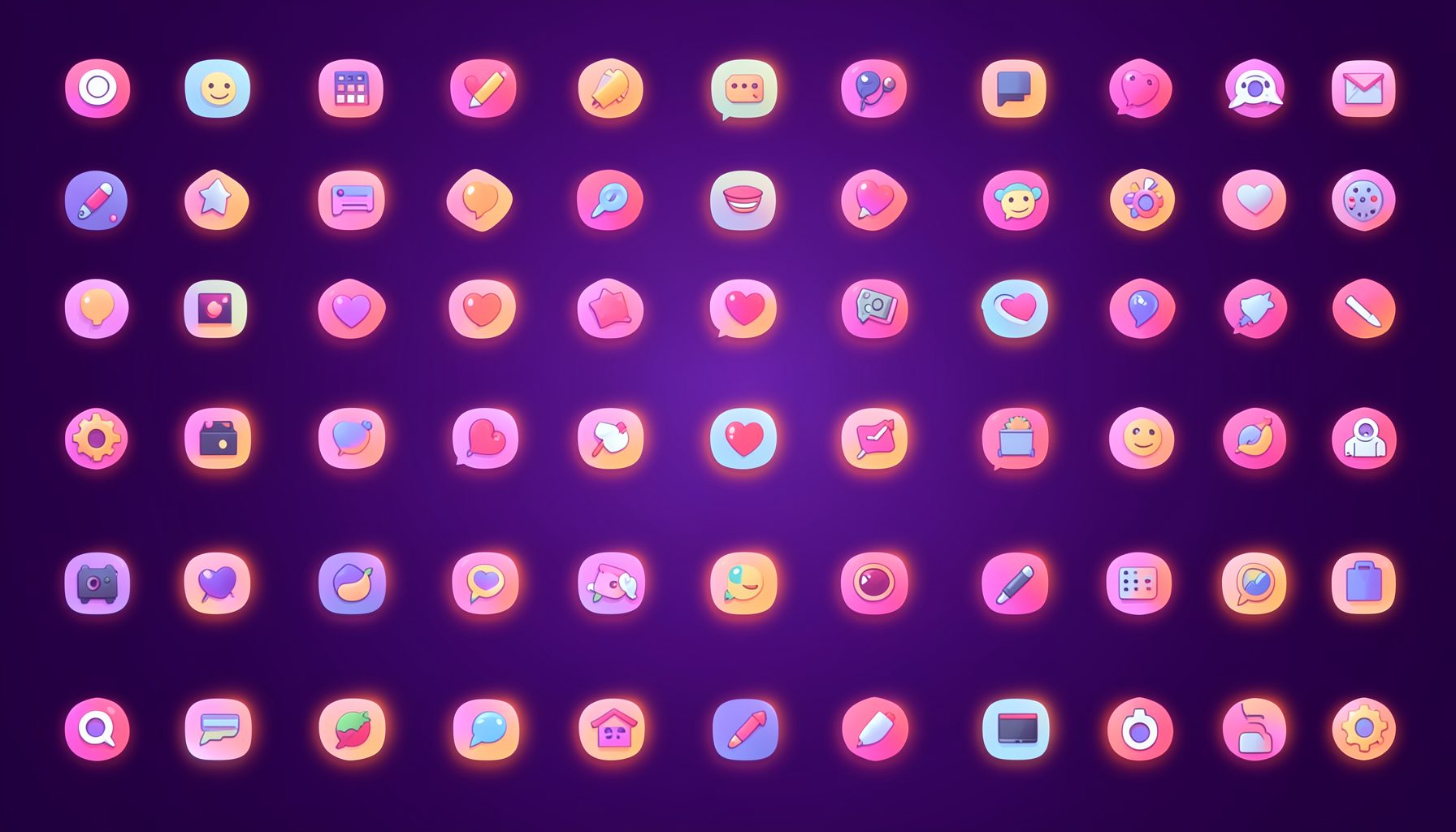
Icons are grouped into 19 categories, from everyday app and business icons to travel, music and user-interface glyphs.
Categories
Apps, Business, Communication, Design, E-commerce, Entertainment, Finance, Holidays & Events, Internet, Media, Miscellaneous, Music, News, Photography, Social, Technology, Travel, User Interfaces, Video.
License & Subscribe
Licensing terms cover use of both free and premium icons in personal and commercial work. Subscribers received email updates on new icon posts, with an RSS feed also available.

Get in touch
Questions, information or icon suggestions could be sent to contact.psdicons@psdicons.net, with replies typically arriving in 1–2 days.
𝕏