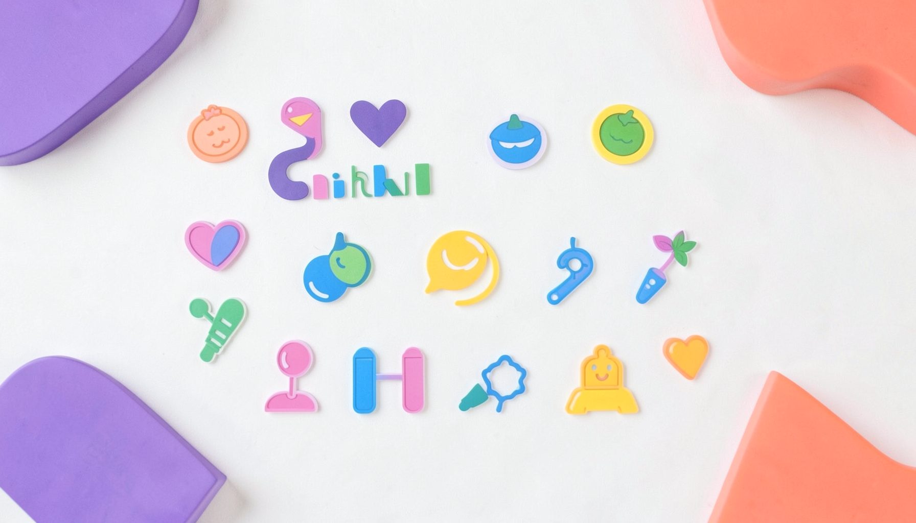
A collection of icons for designers and developers, organized by category and ready to drop into any project.
Icon color palettes for brand consistency
A consistent palette gives every icon the same visual logic, from a checkout symbol to a travel app. It helps a business feel recognisable across its website, application, social channels, presentations and mockups without forcing every symbol into the same colour. The strongest approach is not to colour everything identically, but to assign colours clear roles and apply them consistently.
That distinction matters when teams use assets from PSD Icons, where editable Photoshop PSD vector files and transparent PNGs appear in collections for business, technology, finance, travel, social media and user interfaces. A free set may suit an early concept, while a premium pack offers broader coverage for a growing product. The palette should be decided before icons are scattered across a growing library.
Define the palette’s visual roles
Begin by separating colours into functional roles. A primary colour can identify main actions or signature icons, while secondary colours support navigation and less prominent controls. Accent colours should be reserved for attention, status or special emphasis. Neutral tones then handle backgrounds, disabled states, dividers and secondary information. This hierarchy keeps a bright hue from competing with every other element on the screen.
Document the purpose of each colour rather than listing a collection of attractive swatches. Record which colour represents selection, warning, success and information, and note whether a particular hue is approved for logos, outlines or solid fills. If an icon represents the same action across several products, it should retain the same treatment wherever it appears.
Before approval, test the swatches in context. A quick scan of colour palette inspiration can help reveal whether a vivid accent fits a product-focused visual style or clashes with it, although the final palette should still be judged against the brand’s own audience and assets.
Adapt icons across screens and media
Digital interfaces place icons at different sizes and against changing backgrounds. A colour that feels balanced on a large desktop button may become indistinct in a compact mobile navigation bar. Sydney and Melbourne businesses commonly present their brands through websites, apps, social media and in-store screens, so each version needs to remain recognisable without requiring separate artwork for every placement.
Create a practical range of tints, tones and shades for each approved hue. Use the full-strength colour where emphasis is needed, then develop lighter or darker variations for surfaces and pressed states. Transparent PNG exports should be checked over light, dark and photographic backgrounds. PSD masters should remain editable so designers can adjust scale and placement while preserving the original structure.
Brand consistency does not mean identical density everywhere. Travel icons may benefit from a more illustrative treatment, finance symbols may require stricter clarity, and social media assets may need stronger contrast. The same palette can support these differences as long as the colour relationships remain stable and the approved hues retain their assigned roles.
Protect clarity and accessibility
Colour should reinforce meaning rather than carry it alone. Red and green status indicators can be difficult for people with common colour-vision deficiencies, so pair them with a distinct shape, symbol or short label. This is particularly important in banking, transport and commerce interfaces used by Australian customers on the move, often while checking an application during a commute.
Test contrast against the actual background rather than a white artboard. WCAG 2.2 AA guidance generally calls for a contrast ratio of at least 4.5:1 for normal text and 3:1 for large text and meaningful non-text graphics. Public-facing services in Australia may also be subject to government accessibility standards. These checks improve usability for everyone and reduce ambiguity in dense interface packs.
The Australian Consumer Law adds another reason to keep interfaces understandable: marketing claims and digital services must not mislead customers. Although it does not prescribe brand colours, inconsistent symbols or unclear status colours can make an online transaction harder to interpret. A controlled palette supports clearer journeys across Australian ecommerce, hospitality, banking and government-service contexts.
Create a controlled asset workflow
Give every approved colour a name and code, such as a neutral, primary or semantic status token. Store those definitions in a shared style guide and apply them consistently in design files, code and export settings. Names such as “blue” become ambiguous across teams; a token tied to a specific function remains useful when several shades share the same family.
Separate source files from finished exports. Keep the editable PSD collection as the master, then produce transparent PNGs for web and application use. Standardise the digital colour space, export dimensions and file naming so a designer in Brisbane can recognise the same asset as a colleague in Perth. Archive retired colours rather than deleting them, since old campaigns and presentations may still require reconstruction.
PSD Icons’ free and premium collections can support this structure, particularly for teams assembling interfaces across several categories. New releases also make version control important. Subscribe for catalogue updates, record which pack and version supplied each asset, and check licence details before adding icons to commercial work.
Turn the palette into everyday practice
A palette works when designers can apply it without repeated interpretation. Create a small reference showing primary, secondary, accent and neutral roles, then add examples of acceptable and prohibited combinations. Include guidance for hover, selected, disabled and warning states alongside rules for using transparent PNGs and editable PSD masters.
Review new icons as part of the design process, not after a product launch. Check that their colour communicates the correct role, that their forms remain legible at small sizes and that they align with icons already in use. This prevents one unusually bright or muted asset from weakening an otherwise coherent set used across websites, apps, decks and mockups.
Browse the free and premium collections at PSD Icons, choose a palette suited to your brand, and download the editable PSD and transparent PNG files for your first project. Subscribe for new-release updates and make each new icon an approved extension of the same visual system.
Ultimate Flat Social Icon Set
A premium pack of 70 icons delivered in PSD and PNG, across 4 sizes and 2 different styles, with an HTML/CSS3 version included.
It was built to complement the free library for projects needing a consistent, flat social icon set.

Browse by category
Icons are grouped into 19 categories, from everyday app and business icons to travel, music and user-interface glyphs.
Categories
Apps, Business, Communication, Design, E-commerce, Entertainment, Finance, Holidays & Events, Internet, Media, Miscellaneous, Music, News, Photography, Social, Technology, Travel, User Interfaces, Video.
License & Subscribe
Licensing terms cover use of both free and premium icons in personal and commercial work. Subscribers received email updates on new icon posts, with an RSS feed also available.

Get in touch
Questions, information or icon suggestions could be sent to contact.psdicons@psdicons.net, with replies typically arriving in 1–2 days.
𝕏