A collection of icons for designers and developers, organized by category and ready to drop into any project.
Icon design principles for flat and outline styles
Icons form the small visual grammar of an interface. A search symbol, location marker or payment card carries meaning before a visitor reads a label, so every curve and gap affects speed of recognition. Flat and outline styles can feel equally polished, but they demand different levels of discipline.
Designers working across websites, mobile apps, mockups and presentations need a set that stays coherent at many sizes. What looks generous on a large canvas can become crowded on a 16-pixel button, while delicate strokes can disappear on a bright display. The underlying system matters more than any single polished symbol.
A strong icon collection begins with shared rules for proportion, geometry, colour and spacing. It also needs enough flexibility for real products, from a council website to an Australian retail checkout. Clear icon design principles turn those rules into assets that teams can use without rebuilding them for every screen.
Build a system before drawing icons
Start with a common grid and decide how much information each symbol must carry. Most interface icons work best when reduced to one central idea and given enough breathing room. Sketching the silhouette first helps reveal whether a concept remains recognisable without colour, shading or a text label.
Flat icons rely on solid shapes, so their boundaries need particular care. Outline icons depend on the weight, joins and ends of every stroke. Set a consistent canvas, corner language and alignment rule before creating individual assets, then treat any exceptions as deliberate rather than accidental.
Simplify shapes for fast recognition
Favour a silhouette that can be understood at a glance. A shopping bag, document and envelope may be familiar enough, but a folder crowded with tabs becomes a different object at small sizes. Remove decorative detail, close gaps that create visual noise and check that the negative space is as deliberate as the positive shape.
Metaphors should be shared, not merely clever. An Australian travel set might include a ferry for Sydney Harbour, a tram for Melbourne or a koala for wildlife tourism; each needs a clear job within the set. Cultural references require care, especially when motifs carry meaning beyond decoration.
Apply colour with restraint
Colour helps users scan categories, but it should reinforce meaning rather than supply it. A green tick can suggest approval, yet colour alone is unreliable for users with colour-vision deficiency. Pair meaning with shape and check contrast against light and dark backgrounds, including non-text contrast where an icon communicates a control or status.
A restrained palette also makes mixed collections easier to deploy. Australian retail and finance screens often combine delivery, account, card and GST information; distinct colours can group those actions, but inconsistent hues will make them look unrelated. Test every asset with labels too, since many icons should support text rather than replace it.
Keep geometry and strokes consistent
In an outline set, standardise stroke weight, line caps and corner joins across every asset. On a 24-pixel grid, a two-pixel stroke may work for one symbol but need optical adjustment around a small circle or tight corner. Equal geometry can still look uneven, so inspect the whole family together rather than judging files in isolation.
Keep flat artwork free of gradients, bevels and shadows, then give internal spacing and edge clarity the same attention. Maintain a consistent optical size, whether the icon sits beside a 12-point label or fills a 48-point tile. Avoid mixing filled and outlined versions casually; style changes should indicate a specific interface state, not simply make a catalogue look varied.
Adapt symbols for Australian contexts
Australian public services run from myGov screens to Brisbane City Council forms, so civic symbols need plain meanings rather than decorative institutional imagery. The free civic icon resources can help teams serving federal agencies and local councils build a consistent, non-partisan visual language.
Local context also reaches into spelling, transport and cultural content. Use Australian forms such as “favourites”, “organisation” and “licence” where labels are needed, and choose transport symbols that work in both Sydney and Melbourne. Tourism artwork based on Aboriginal motifs or significant places should involve respectful consultation rather than treating them as generic icons.
Test and package the final set
Test assets at the sizes they will actually occupy: navigation bars, compact lists, buttons and high-density tables. Inspect them on different displays, in light and dark themes and in greyscale. A quick check with colleagues from the target market can reveal an ambiguous symbol that its designer no longer notices.
Keep the editable source organised, with layers, naming and export sizes documented. PSD Icons provides Photoshop PSD files and transparent PNGs suitable for websites, applications, mockups and presentations, while consistent grids make later updates faster and less error-prone.
Choose a free collection from PSD Icons or purchase an expanded premium pack for your next project, then subscribe for email updates on new releases and build a visual language your team can trust.
Ultimate Flat Social Icon Set
A premium pack of 70 icons delivered in PSD and PNG, across 4 sizes and 2 different styles, with an HTML/CSS3 version included.
It was built to complement the free library for projects needing a consistent, flat social icon set.
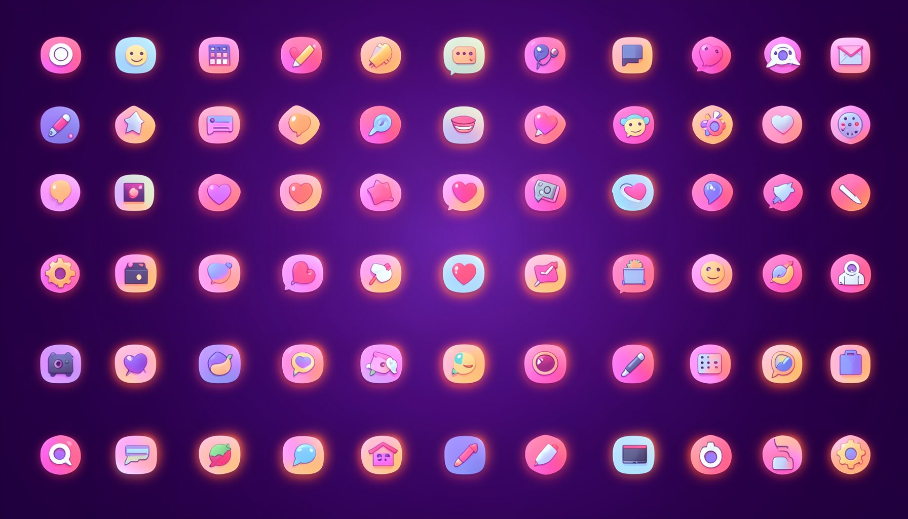
Browse by category
Icons are grouped into 19 categories, from everyday app and business icons to travel, music and user-interface glyphs.
Categories
Apps, Business, Communication, Design, E-commerce, Entertainment, Finance, Holidays & Events, Internet, Media, Miscellaneous, Music, News, Photography, Social, Technology, Travel, User Interfaces, Video.
License & Subscribe
Licensing terms cover use of both free and premium icons in personal and commercial work. Subscribers received email updates on new icon posts, with an RSS feed also available.

Get in touch
Questions, information or icon suggestions could be sent to contact.psdicons@psdicons.net, with replies typically arriving in 1–2 days.
𝕏