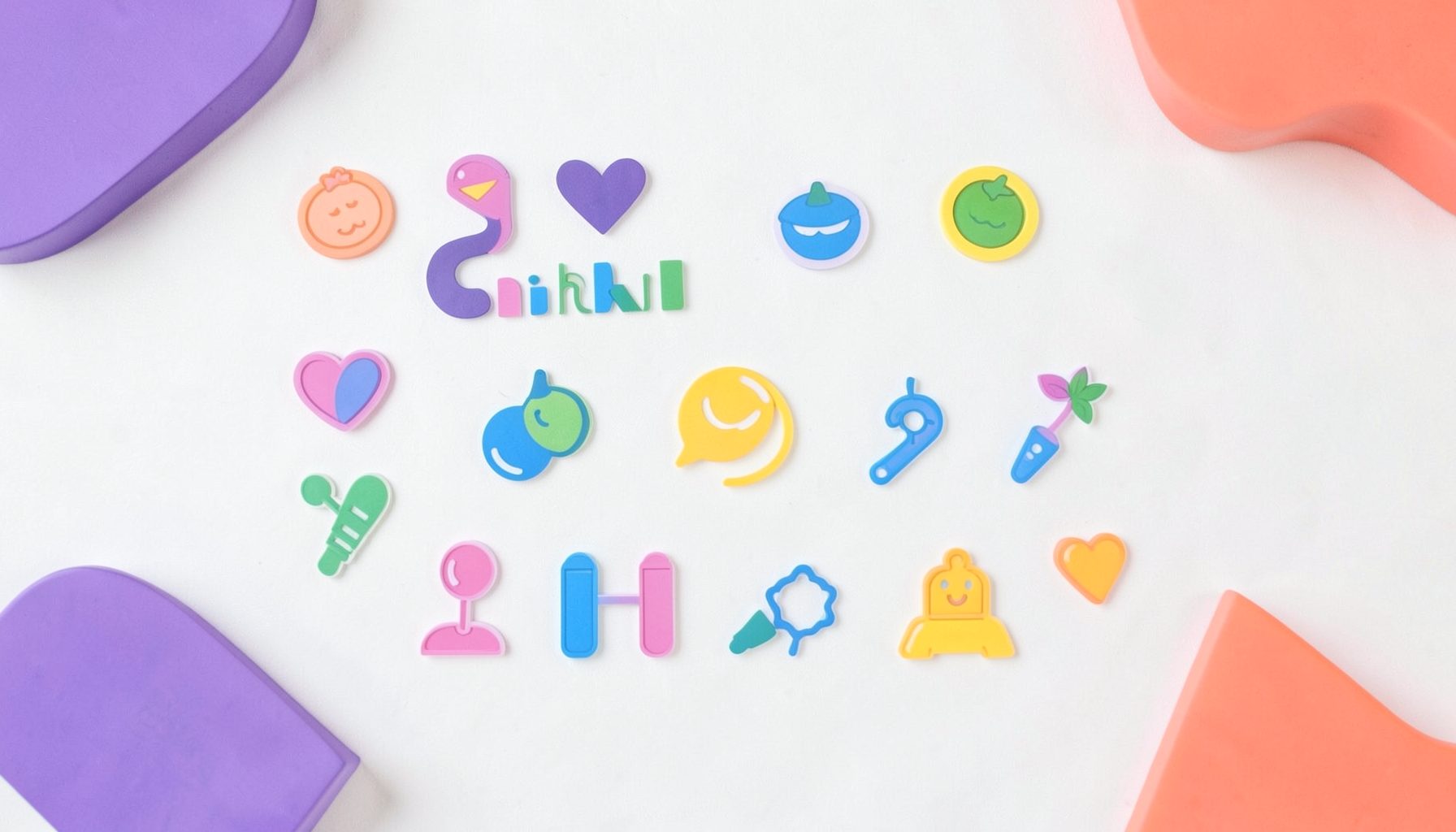
A collection of icons for designers and developers, organized by category and ready to drop into any project.
Icon design trends for 2024 in digital products
Icon Design Trends for 2024 in Digital Products are moving away from isolated pictograms and toward coherent visual systems. Icons now communicate status, navigation, permissions and brand personality across products that may be viewed on a phone, watch, kiosk or large display.
Design teams are also treating iconography as interface grammar rather than decoration. Consistent geometry, naming and behaviour make products easier to learn, while flexible source files allow the same symbol to work across light, dark and high-contrast environments.
For Australian teams, these choices must support mobile-first habits, accessible services and familiar settings such as public transport, retail apps and government platforms. PSD Icons provides free and premium collections in editable Photoshop PSD and transparent PNG formats for these practical product requirements.
Interfaces are becoming visual languages
Modern applications present icons alongside navigation labels, data and calls to action. Their value now depends on recognisable meaning and predictable placement, particularly in dashboards where users need to locate a function quickly.
A symbol should communicate one clear idea. Reusing a bell for notifications and a clock for reminders may appear efficient, but overlapping meanings increase hesitation. Persistent labels and familiar metaphors usually create faster, more confident interactions than symbols that require interpretation.
Minimalism with optical precision
Simplified iconography remains prominent, with designers reducing unnecessary detail and favouring geometric forms. The distinguishing feature is precision: stroke weight, corner radius, negative space and alignment need to feel consistent even when the underlying shapes are mathematically different.
Optical balance matters across responsive layouts. A tiny glyph, a spacious menu icon and a dense chart symbol cannot share identical dimensions without looking weak. Test assets at 16, 20, 24 and 32 pixels, then adjust individual forms while preserving the system’s visual rules.
Expressive colour and dimensional depth
Restrained duotone combinations, subtle gradients and soft shadows add personality without returning to heavily rendered icons. These treatments work well for selected actions, premium features and branded empty states, while essential navigation symbols often benefit from simpler monochrome versions.
For research beyond interface examples, this external consumer reference can prompt wider questions, but user testing should determine whether a symbol carries the intended meaning. Layered PSD artwork helps designers switch between outline, solid, duotone and monochrome treatments without redrawing the entire set.
Accessibility as a design constraint
Accessible iconography requires more than adding a text label. Symbols need sufficient contrast, distinguishable silhouettes and touch targets appropriate for Australian mobile users. Under WCAG 2.2 AA, meaningful graphical objects should generally maintain a contrast ratio of at least 3:1 against adjacent colours.
Legislation reinforces the need for clarity. The Australian Consumer Law can apply when an icon creates a misleading impression about price, payment or functionality, while the Privacy Act 1988 means consent and data-collection controls should never rely on an unexplained symbol. The Australian Government Digital Service Standard also makes accessibility essential for public-facing digital services.
Motion, state and adaptive behaviour
Micro-interactions give icons a clearer role in digital products. A loading symbol can morph into a confirmation mark, and a navigation glyph can subtly indicate the selected state. These transitions provide immediate feedback, but motion should explain a change rather than delay the task.
Reduced-motion preferences, static fallbacks and clear loading states remain essential. Adaptive icon systems can also adapt to device themes, home-screen placement and platform conventions, helping a familiar symbol retain its identity across different environments.
Designing for Australian digital habits
Commuters in Sydney, Melbourne and Brisbane regularly use banking, transport, food-delivery and retail apps with one hand while travelling. Larger touch areas, high-contrast symbols and labels that remain visible on crowded screens are especially valuable in these settings.
Local products also serve a broad market spanning e-commerce, tourism, superannuation, banking and government services. Culturally neutral symbols generally travel well, while symbols connected to Aboriginal communities require careful consultation. Bright outdoor conditions and regional connection speeds further favour lightweight assets, fast interfaces and downloadable PNG bundles.
A practical icon system checklist
Build the system around real product tasks before drawing individual symbols. A documented grid, naming scheme and source library will keep future additions coherent.
- Audit navigation, actions and status indicators to identify where icons genuinely improve comprehension.
- Establish a master grid, corner radius and stroke system with permitted optical adjustments.
- Create outline, solid, duotone and monochrome variants from organised layered PSD files.
- Test every asset at common interface sizes and against light, dark and high-contrast backgrounds.
- Pair important glyphs with persistent text so colour, shape or animation is never the sole cue.
- Validate the set with Australian users, then export transparent PNG files for implementation.
Explore the free collections at PSD Icons, compare the expanded premium packs and choose a foundation that can scale from a compact mobile app to a complex dashboard. Subscribe for new releases and build the next digital product with a visual language that remains clear, consistent and ready for real-world use.
Ultimate Flat Social Icon Set
A premium pack of 70 icons delivered in PSD and PNG, across 4 sizes and 2 different styles, with an HTML/CSS3 version included.
It was built to complement the free library for projects needing a consistent, flat social icon set.
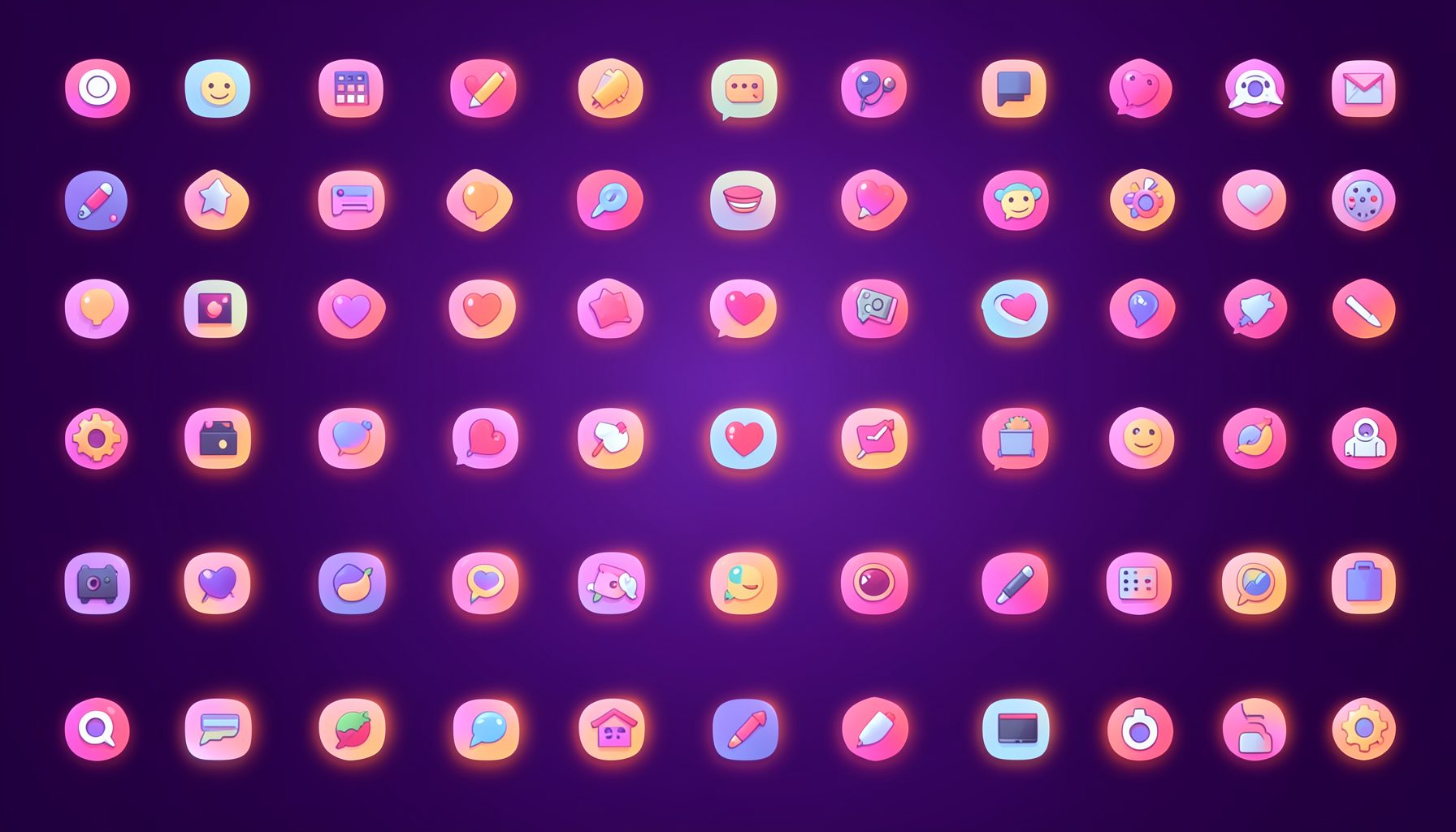
Browse by category
Icons are grouped into 19 categories, from everyday app and business icons to travel, music and user-interface glyphs.
Categories
Apps, Business, Communication, Design, E-commerce, Entertainment, Finance, Holidays & Events, Internet, Media, Miscellaneous, Music, News, Photography, Social, Technology, Travel, User Interfaces, Video.
License & Subscribe
Licensing terms cover use of both free and premium icons in personal and commercial work. Subscribers received email updates on new icon posts, with an RSS feed also available.

Get in touch
Questions, information or icon suggestions could be sent to contact.psdicons@psdicons.net, with replies typically arriving in 1–2 days.
𝕏